Self-Similarity Matrices and Xenakis
Now that I’m updating my blog again, it occurred to me that I never posted about my musical studies capstone thesis. Rather than post a bloggy version of the things I was thinking about, like I did while working on my honors research, I’m going to keep things brief and only discuss one of the computational methods that I used, which is a neat data visualization technique.
The full paper, which is an analysis of the 20th century composer Iannis Xenakis’ 1959 work Analogique A et B, is available here. It, like most undergrad capstone theses, is far longer than it needed to be, but goes into some depth surrounding both the statistical tools that were used to make the piece and the tools I used to analyze it.
Addendum: There’s an error in that thesis document, I cite the fantastic work on Xenakis by Kerry Hagan but misgendered her in the text. I can’t change the thesis file on OhioLink, but I’m really sorry!
Self-Similarity Matrices
The technique I’m interested in writing about is the self-similarity matrix, which is a tool for visualizing structure within sequence data. The best way to understand it is through examples. For instance, if we have a sequence of numbers 1,2,3,1,1,2,3,5 and want to understand which parts of the sequence are similar, we can compute the similarity of each pair of points, and arrange those numbers into a grid, where the similarity of points a and b is at position (a,b). If we plot colors instead of numbers, we get a neat visualization.
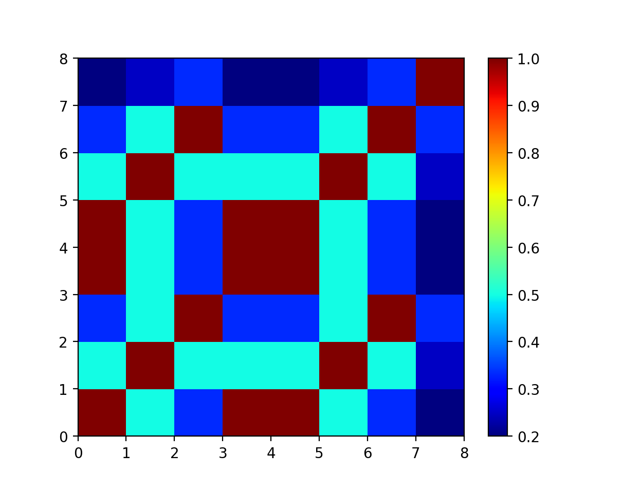
Some things to notice: the diagonal is all 100% self-similar, since every number is similar to itself. The graph is symmetrical across the diagonal, because the similarity between two numbers is the same, no matter how you order the numbers. The similarity numbers are all between 0 and 1, because I measure the similarity between two numbers as Similarity(a,b) = 1/(1+|a-b|). The parallel red diagonal lines at (0,0) and (0,4) show an identical subsequence appearing later.
Bag of Words and Cosine Distance
So how does the self-similarity matrix apply to music? We can’t just take the distance from one note to another to measure the “similarity” between those notes, and we can’t plot multiple colors for multiple overlapping notes in polyphonic music. I borrow a solution to this problem from natural language processing (NLP) in computer science.
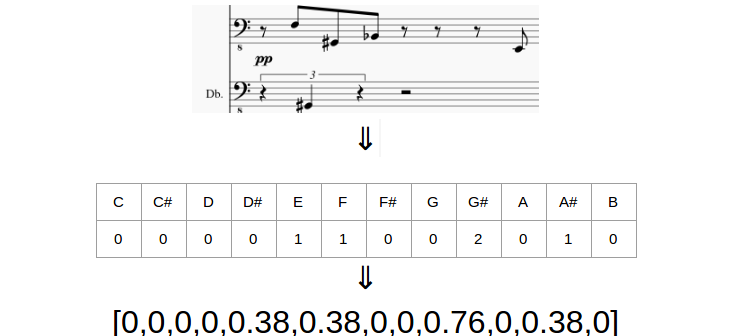
NLP uses a tool called the “Bag of Words” model to convert text into numbers. The bag of words of a document is the histogram of words in that document, i.e. for each word, count the number of times that word appears in that document, then put those counts in a list. The mental image that gives rise to the name is a newspaper article, cut up with scissors into tiny strips of paper, one strip per word, thrown into a bag. In that way, we lose the order of words, but gain a way to talk about the document using a single list of numbers.
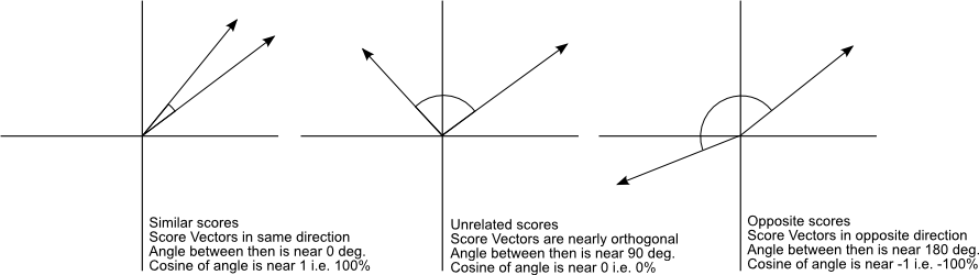
The neat thing you can do with those bags of words is measure their similarity using trigonometry. The cosine of two vectors is close to 1 if those vectors are almost the same and close to 0 if they are totally different.
(Source, which is also a good, more technical approach to some of these concepts)
That’s exactly what we were looking for, a way to compare collections of notes! If we substitute words for notes and documents for measures of music, we get a fairly easy way to compare two passages of music!
Comparing passages of music based on cosine distance is comparing passages of music based on how often they use each pitch, which carries a lot of assumptions. There are variants on this metric that can take things like key into account (where you use scale degrees instead of pitches), or ignore octave differences (where you use pitch classes instead of pitches), but neither of those addresses the elephant in the room: we are deliberately ignoring most of the actual content of music, which depends on the order of notes. Actual similarity of musical material is much more subjective and nuanced, so take the analysis below with a grain of salt.
Mozart K155
While the grid diagram above doesn’t seem too useful, SSMs become much more informative when the sequence is longer and more complicated. For example, this is the SSM for a Mozart string quartet (K155, first movement):
When the Mozart is visualized this way, you can see some of the form in the colors of the matrix. For instance, if you focus on the lower left corner, the start of the piece, The parallel red lines right before (32,32) indicates a four measure passage that repeats, which turns out to be parallel period in the second theme.
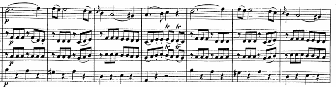
The blue line around the x=33 vertical is a measure with a diminished seventh chord that never repeats (a different diminished seventh chord appears in the recapitulation, in fact, it also causes a blue line, around x=92).
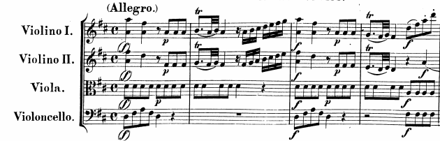
The reds and yellows around (72,0) indicate similarity between the start of the piece and measure 72, which turns out to be the start of the recapitulation the figure below shows the score in these locations).
Finally, the reds and yellows around (110,64) indicate that the end of the piece borrows from the end of the development.
While this approach seems kind of redundant for analyzing Mozart, since you can figure out these facts just by listening to the piece or glancing through the score, it helps us see very non-trivial things when applied to other kinds of music.
Xenakis Analogique A
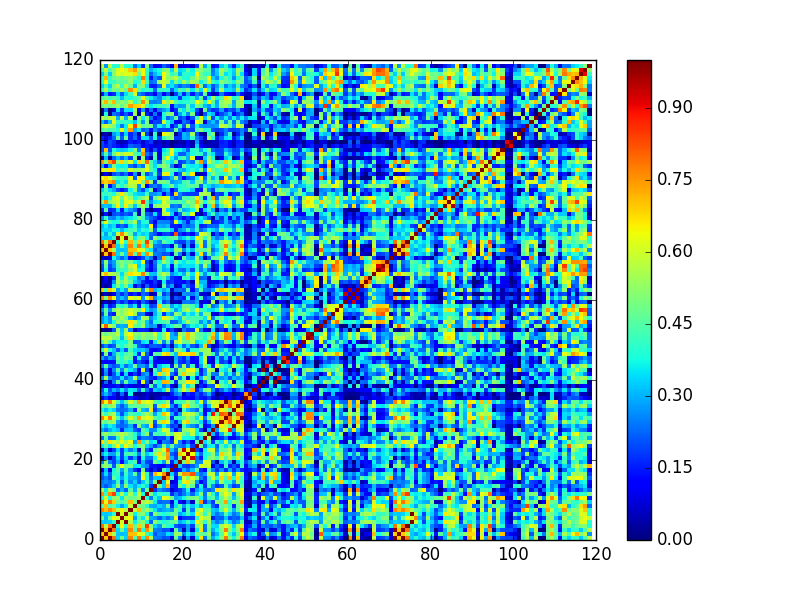
The piece I analyze in my capstone thesis, Iannis Xenakis’ Analogique A et B creates a very different-looking SSM.
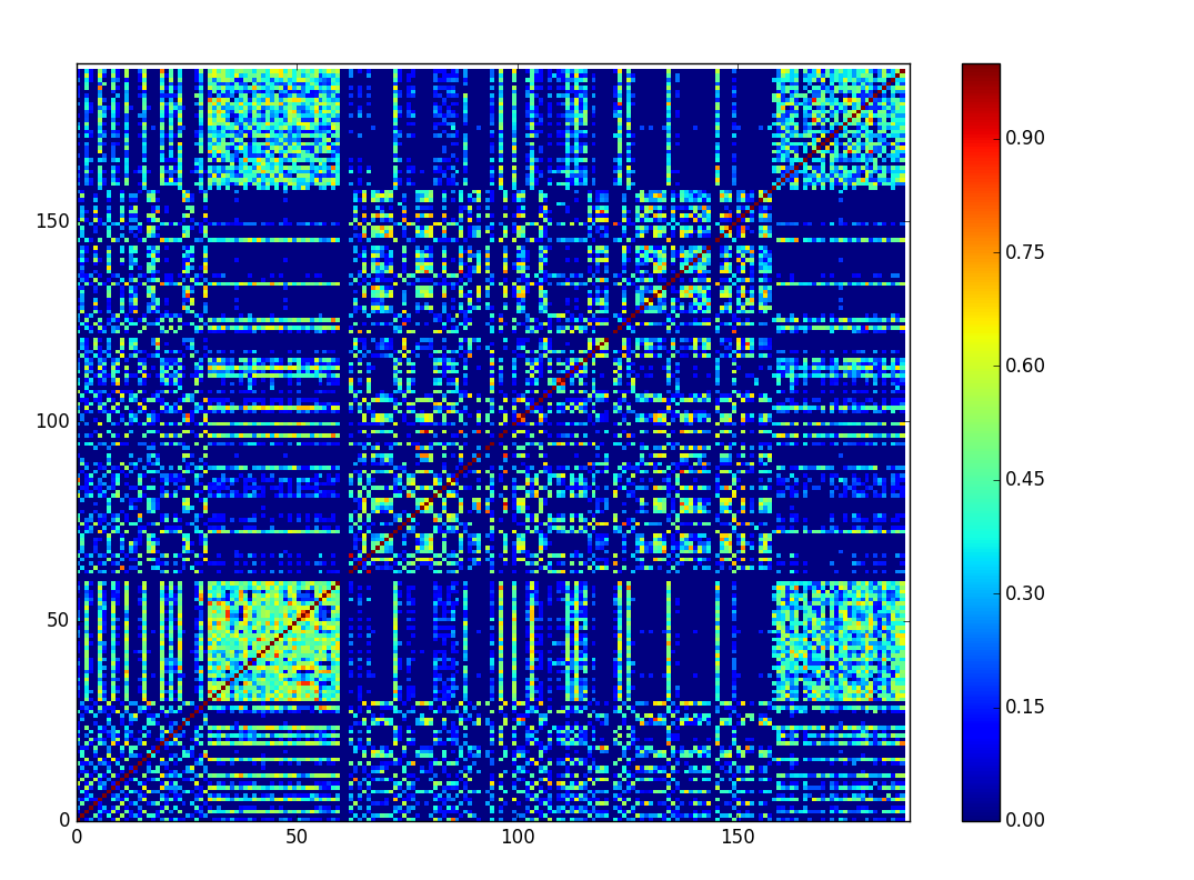
Unfortunately, due to time constraints I was only able to create this matrix for the first 90 measures out of 150 of the piece. The unit here is no longer the measure, but the half measure, since that was Xenakis’ compositional time unit.
The first thing that pops out is all of the blue. While the Mozart mostly used the same pitch collection from start to end (it is tonal music after all), Xenakis almost never uses the same pitch collection from measure to measure. The exception is in the second and sixth parts of the piece, where the pitch collection stays constant. We can see exactly how extreme the use of non-overlapping pitch sets is via a graph of pitch vs. time:
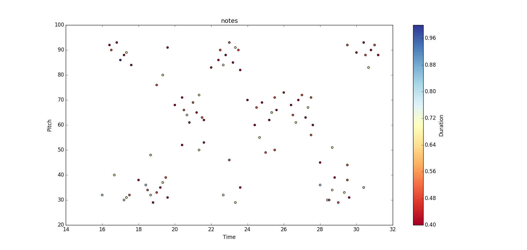
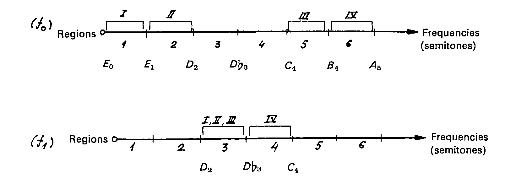
Here, the X-axis is time, measured in half-measures and the Y-axis is pitch, measured with midi numbers. With this visualization, we see that Xenakis is not just using two non-overlapping pitch sets, he’s splitting pitch-space into two regions. He wrote very specifically about why in his book, which has a matching diagram:
For details, read my paper! This work is a wonderfully complicated statistical mess that Xenakis ultimately considered a failure, and I investigate how he may have broken his own rules in order to make it turn out the way he wanted.
Independent of Xenakis, Self-similarity matrices are a good visualization technique for sequence data and a convenient tool for some kinds of musical analysis that should be in any contemporary music theorist’s toolbox.