Probablistic Models of Color Harmony
TL;DR I did a generative art project based on research into color theory: see it here.
Color Harmony Models
For centuries, scholars have been thinking about why certain colors look better together than others. This research area, called color harmony, is inspired by musical theories of harmony. We have robust models which can predict whether several notes will sound harmonious together, so why can’t we do the same thing with color?
Early scholars, like da Vinci, answered this question with suggestions based on contrast. In the 20th century, scholars started building quantitative models to formalize these ideas. One such model is the Moon-Spencer color model:
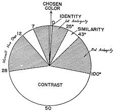
This model draws inspiration from the work of Johannes Itten, who believed that colors looked best together when they were clearly similar or clearly contrasting. If colors were too close together, or too far to be similar but not far enough to be contrasting, they would appear ambiguous and look bad together. Moon and Spencer formalized that theory into angles on the color wheel.
This model makes the assumption that color harmony is hue independent, meaning that the rules that apply to blue are the same as the rules that apply to red, green, yellow, etc. This assumption is the basis for color scheme generators like paletton.com.
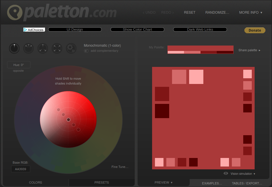
These websites use color templates, shapes on the color wheel, to generate color schemes, and have recently become very popular. However, research shows that color templates aren’t actually a good way to create pleasing color schemes, and professional artists and designers tend to use color templates for inspiration, then adjust them intuitively.
Measuring Influence
This got us wondering, can we measure the popularity of different template-based color scheme generators on the web? There are two big problems with that question. First, correlation isn’t causation: we can never know whether a designer used a color scheme generator without asking them. Second, we can’t know how color scheme generators work: we can use them to generate new color schemes, but can’t see how they arrive at those colors under the hood.
While we can’t say for certain that a particular website uses a particular color scheme, we can measure how prevalent certain ideas about color harmony are on the web. And while we can’t know how these color scheme generators work, we can use machine learning to learn an approximate model for their processes.
I’m still working on the results here, but here’s some early results: I collected data from my own color template-based generator, colormind.io and colourlovers.com, and fit models to them, then measured how likely the models were to produce real websites’ color schemes.
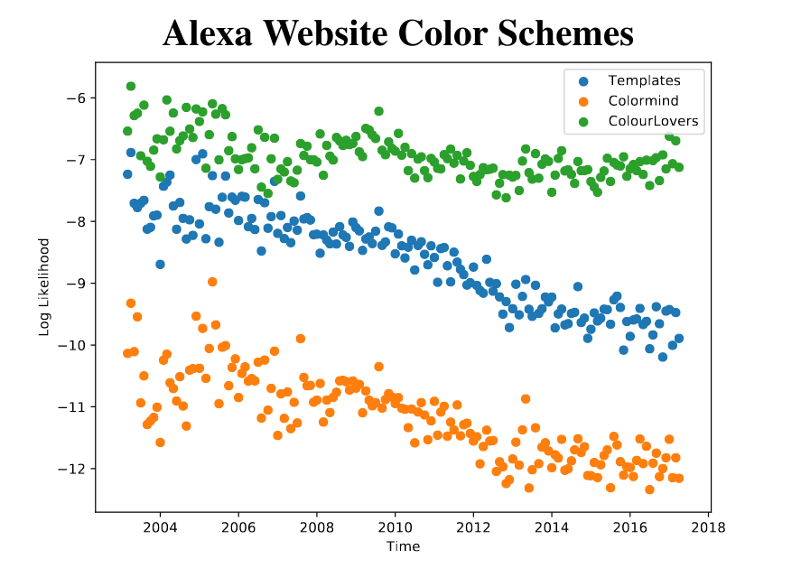
It turns out websites are steadily getting less template-based, on average. I’m not really sure why yet, but I’m looking into it. If you’re interested, you can read the details in our paper.
Generating Color Schemes
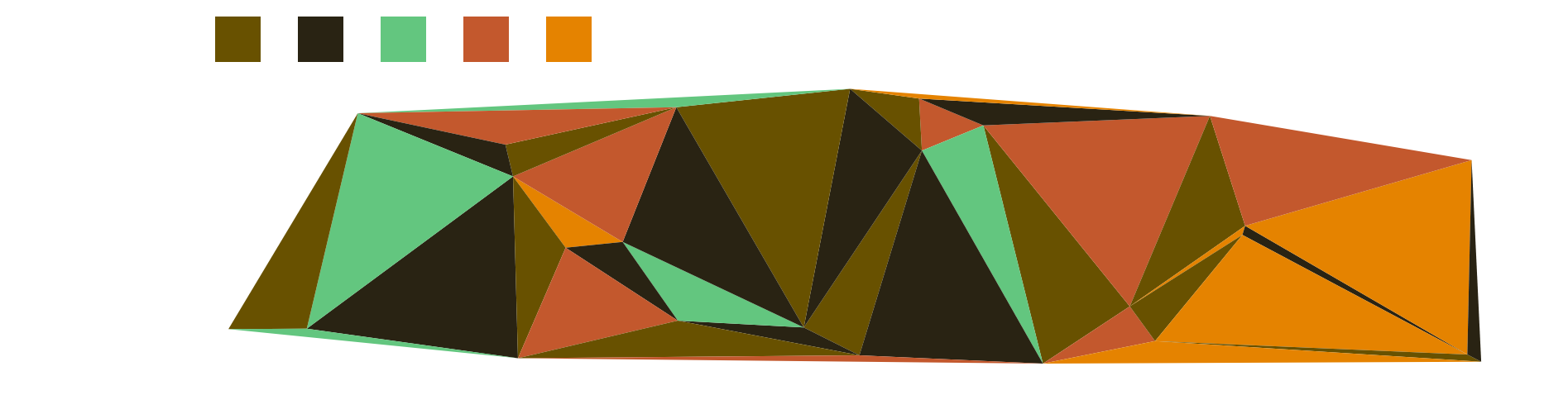
While the model we learned initially wasn’t able to generate color schemes of its own, I figured out a way to do it. Rather than just create my own color scheme generator, I decided to use this as an excuse to do some generative art. I use my model to generate a color scheme, then use that scheme to color in a Delaunay triangulation. Here are some examples:

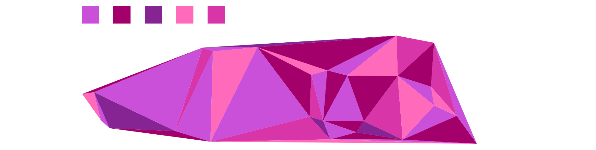
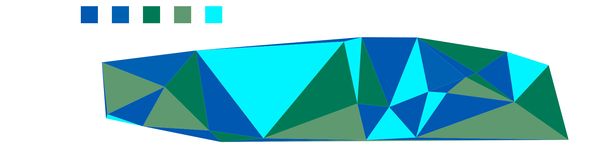
As an artist, I’m not thrilled with the result (conceptually, it’s kind of boring), but as a researcher, I think it is a great way to visualize the kinds of colors schemes these models learned!