History of Web Design Website
I made a little website on NeoCities to promote our recent CHI paper and wanted to post it here and point out some of the ideas behind my designs.
The project we did (which you can read about on the website or in the paper) investigates the question, “do websites really look more similar now?” We scraped hundreds of thousands of images of websites from the Internet Archive and used a variety of computer vision techniques to analyze them. But we didn’t stop there, we also conducted interviews with eleven veteran web designers and asked them about how their design tools and processes had changed over time. We found that yes, websites do look more similar now, and found a couple reasons why.
To both describe and illustrate the ways in which web design changed over time, I made three pages in three different development paradigms. I’m going to describe them here.
First Page: Welcome to My Site
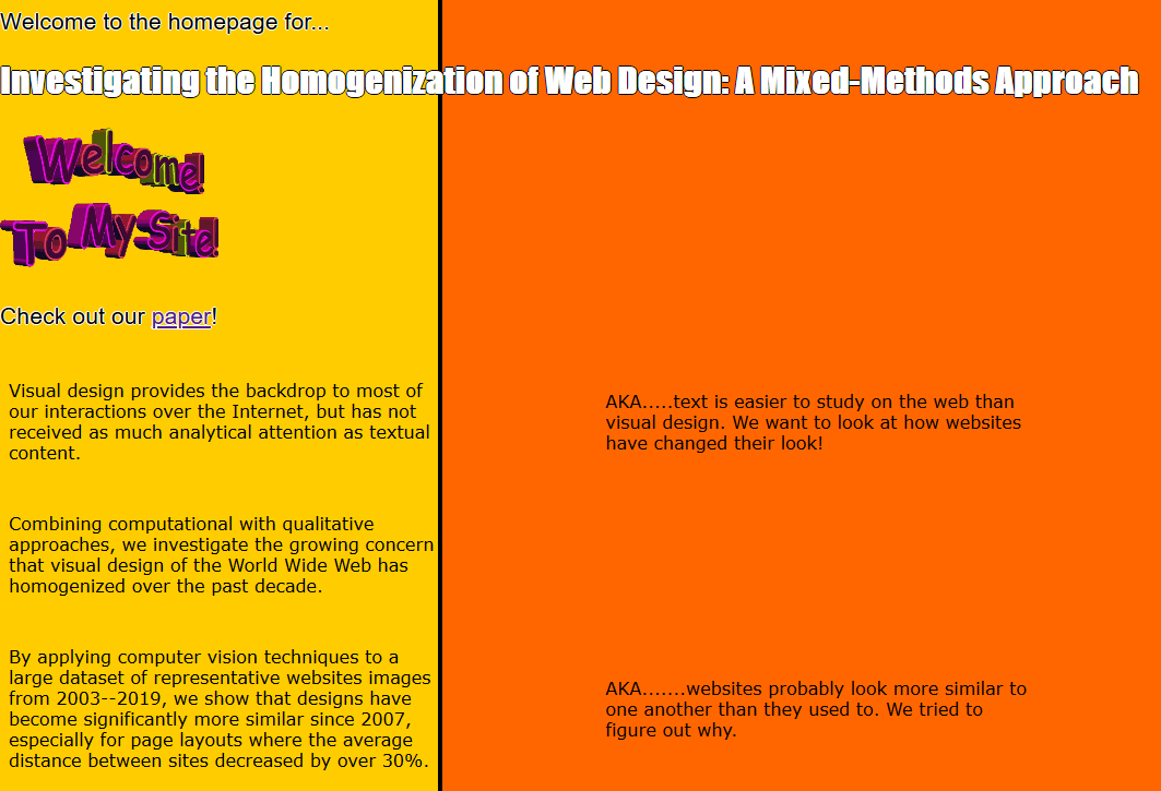
In the early days of the web, design was a free-for-all. People mostly wrote raw HTML, and didn’t think much about the design of their site. Such recklessness led to a wonderful variety of confusing, difficult-to-use or just ugly designs. The visual differences were a consequence of the design of the web itself: the web had been designed in terms of hypertext, an idea which had been floating around information science since the 1960’s where parts of a text could link to other texts, storing documents in a graph, rather than a list-like directory. Hypertext, though, wasn’t a graphical medium, and the visual elements of the web emerged as an afterthought, requiring a variety of tricks and hacks to work well.
In this environment, background images and in-line images became the key elements of visual expression, but because of low bandwidth on most internet connections, images came at a steep cost: load time. Pages with many large images could take seconds, or even minutes, to load on a slow connection, so web designers developed strategies for making images as small as possible. Animated GIFs were important during this period, as they were the only option for animation on the web before Flash, and take up relatively little bandwidth.
To capture this era, I made use of a repeating background from the well-known website A List Apart archived in 1999. This background image is only 408 bytes, it’s only 32 pixels tall, but repeats to give the illusion of a colored background. I also include a “welcome to my site” and spinning portal GIFs. The portal especially is a particularly 90’s interaction pattern, making use of a tacky metaphor.
Second Page: AltaVista
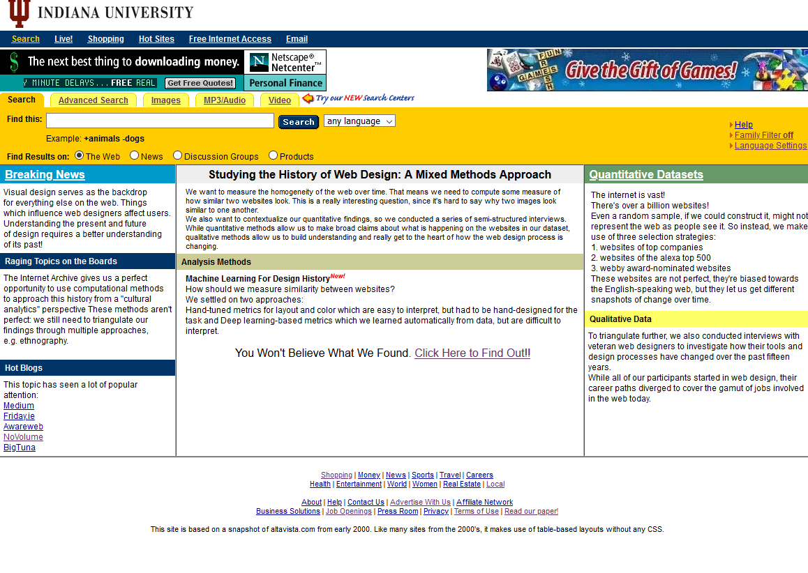
This page brings us forward into the early 2000’s, when web design had become a little more systematic. The solution to visual design on the web, cascading style sheets (CSS), was proposed in 1994 and adopted in 1998, but many web browsers did not support it fully until much later. During this interim period where different browsers supported different parts of the CSS standard, designers developed strategies for making websites look consistent, which relied on HTML tables instead. These table-based layouts abused the fact that content in a table would be spaced out in the browser based on the size of the largest element in each row and column, so designers would mock up their page in Adobe photoshop, then slice the design into rectangles and put each rectangle as an image in a table cell.
This page is a parody of a snapshot of AltaVista from 2000. It uses a table-based layout, along with some archived banner ad GIFs at the top. It has a dense layout as a result, with lots of text and links packed into a relatively small page area. This design reflects the design philosophy of placing content “above the fold” so that users who were uncomfortable with scrolling wouldn’t miss anything.
Of course, I didn’t have time to build out a full parody site, so the links all point to an “under construction” page. These sorts of pages are a bad pattern, since the user builds expectations which are let down, but contemporary 404 error pages (the error code for a missing page) are similarly cutesy today.
Third Page: 2010’s CSS
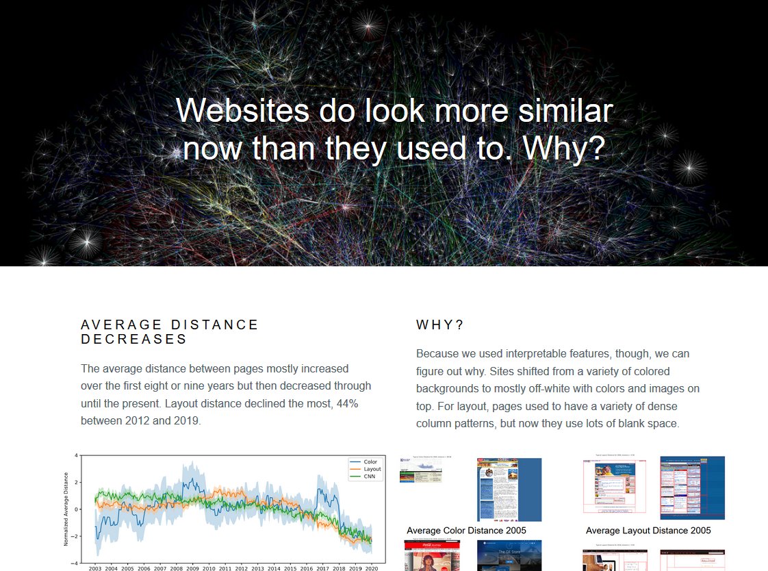
Finally, we reach the 2010’s design paradigm. The spread of smartphones, which viewed the web using small touch screens, forced designers to confront the issue of variable screen size and resolution, which hadn’t been addressed. Responsive web design, which used CSS @media queries to figure out the device’s screen size and rearrange content to match, emerged as the best solution to the screen size problem. Unfortunately, writing a responsive site from scratch was time-consuming, so developers turned to the already-growing world of web frameworks.
In this period, CSS and Javascript were seen as mature web design tools, with a variety of libraries and frameworks available to ease the development of web applications, which had emerged in the later 00’s and followed very different rules from simple static web pages. However, because web designers were using these libraries for static pages as well, complex software engineering build tools like npm and webpack became part of the web design process. Since many web designers lack the programming knowledge or time to engage with tools on this level, lots of sites just keep the template defaults.
This page reflects that trend: it’s based on a PureCSS template for a pricing page. The large “hero image” at the top and three-column format is characteristic of responsive design layouts. On a mobile device, the three columns will stack on top of one another and scale to be more readable, while the large image will scale down to fit the smaller screen. The layout is clean and minimal, there aren’t many stray lines or colors, beyond the off-white background and images. My website (that you’re looking at right now) is built using this same development paradigm. I copied a template that I liked which was originally for an online resume, and modified it to suit my needs. I’ve avoided using Wordpress or another hosting tool since I like having that kind of control, but I could certainly have done that as well and ended up with something quite similar.
Wrapup
So that’s the page I made for this project! I encourage you to read our paper and/or read the website itself to learn more about the research we did! If you like old websites, I encourage you to check out the rest of Neocities, as well as the video game HypnoSpace Outlaw, which is full of wonderful pastiche web designs.
I’m also done with my semester now, and so I have a couple posts in the works to release later this summer. Stay tuned!