How I Redesigned My Academic Website
If you’ve visited my website before, you’ll probably notice it’s changed! While I still like the old look and feel of the page, I set it up six years ago and didn’t really know what I was doing design-wise, so it was time for a change.
While there are a ton of guides out there for creating academic websites, I’ve never seen one about redesigning one. While I’m not a professional designer, I’d like to describe my approach in the hopes that it inspires someone else to do the same.
Why Redesign a Website?
Many people manage their academic web presence based on the principle of “if it ain’t broke, don’t fix it.” While I generally like that philosophy with other things, there are a couple factors which make it a poor approach for design.
- You change over time: a website which works well for a new graduate student isn’t necessarily the best website for a postdoc, or a professor. These different positions require you to communicate different information about yourself online, which lead to different designs.
- Your audience changes over time: a website which exists primarily to find collaborators should look differently than a website which exists to find a job, or find students. These audiences prioritize different information, and are receptive to different cultural signals.
- Meaning changes over time: Design styles have meanings which slowly shift over time as practices go in and out of fashion. That means a design which may have been reasonable at one point in time can send a different signal later on. For example, a website made using a table-based layout with a colored background may have looked like a normal, high quality website in 2002, but now it looks dated and might make you look like you’re stuck in the past.
While there are some designs which are always reasonable, and there’s a sort of charm to a plain HTML page, I think it’s a good idea to tweak your CSS and site architecture every 5-10 years or so.
What did I do?
I like web design, so I maintain my own static site. It’s built using Jekyll and hosted on Github Pages. That said, plenty of people don’t like the programming aspects and use a content manager like Wordpress or Wix instead, which is totally reasonable.
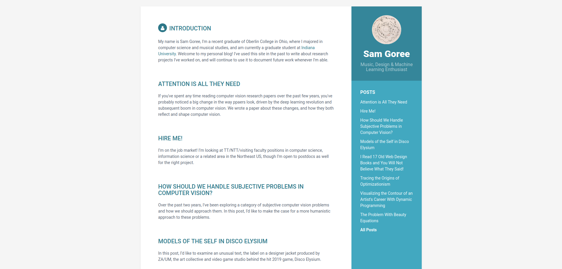
My previous design was kind of hacked together based on a digital resume template. See below for what it looked like at first:
When I first made this site, I thought it would be a digital resume with some blog posts describing my honors research, so I started from there and used Jekyll’s native support for a blog format to insert posts into the same structure. At that point, I didn’t really understand CSS, so I just left all of that as is, and did a lot of little in-line HTML tricks to make each post look right.
The design mismatch is clear: the text is too small and the contrast is too high, making it hard to read, and the reading column is too narrow in the middle of the page, making long posts feel even longer. Colorful sidebars are also very 2010s, and not common on newer websites.
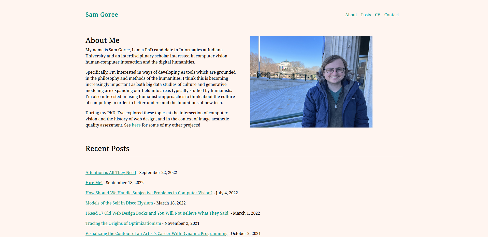
This time, I wanted to start from a dedicated academic website template. I found one I liked on Github and cloned it. I chose this template because it was very minimal (though it does use Bootstrap), and had a site architecture I liked. I wasn’t fond of the font, or the white-on-black colors, so I slightly adjusted the off-white background color from my previous design, and chose a new shade of teal for the hyperlinks. The font I settled on is Noto Serif, a pretty generic serif font for web text maintained by Google (though it has a neat shape for the serifs on the b and d). I’ve been into writing and reading in serif fonts, and wanted that for my posts.
Implementation
Jekyll makes these kinds of redesigns very easy, I just set up my new page with the new HTML layouts and CSS, then copied the existing assets and markdown source from my existing blog on Github. After changing the default branch on Github, Github pages automated deployment took care of the rest.
I made two other little changes:
- I added a Google analytics script to the pages so that I can track who looks at my site.
- I added a “publications” section to my homepage, which auto-populates from a yaml file containing a list of publications.
That’s about it! The entire process (not including writing this post) took about 6 hours of work over two days, mostly fiddling with CSS details and fretting on whether or not to capitalize my headings. If you’re looking for help setting up your own academic website, feel free to reach out!
How I Re-Redesigned My Academic Website
Hello again! Now it’s 2026.
I was surprisingly on-trend in 2022. So much so that a bunch of AI companies like Anthropic and Reflection use that web design style now, and it seems like every AI-generated website is using a yellowish off-white background. I would rather not have a website that looks like tasteslop, so I’m changing to a slightly more garish color combination and off-trend geometric sans-serif font that (I hope) reflects my real human taste.