Talking Mathematically About Color Schemes (Part I)
I’ve been busy with grad school recently, but I thought work I’ve done recently merited a blog post. I’ve been looking at changes in web design over time using image analysis, and we want to find metrics which capture why websites look similar to one another, and use those to identify design trends. For example: when did sites stop using dark backgrounds? When did wide mobile-friendly designs catch on? How often do sites change their layouts without changing their color scheme, or vice versa? Which sites were the trendsetters, which look more similar to sites in the future than the past? In this line of inquiry, I ran into an interesting question: how do you measure the difference between two color schemes?
Even measuring the difference between two individual colors turns out to be pretty difficult, though, since it inevitably involves human color perception, which is complicated and relative, and computer representations of color, which are necessarily imperfect. To make matters worse, we want to measure the difference between two color schemes, which necessarily include multiple colors in varying quantities.
But before getting to all of that, we need to figure a few things out. What is a color? How should we think about different colors and their relationships? What is a color scheme? What does color data actually look like: how do cameras measure it and how should we analyze it? I’m going to build up answers to these questions in this post via some color theory and color science, then get deeper into the math I’m using in a subsequent post.
A Brief Introduction to Color Theory
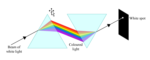
Philosophers, artists and scientists have been thinking about color for most of human history, and over time they’ve made sense of the many contradictions that color seems to exhibit. The Ancient Greeks believed that color was tied to the four elements, on a spectrum between darkness and light. This explanation wasn’t challenged until the 18th century when Isaac Newton published Opticks. He performed an experiment where he used a prism to split white light into a spectrum of colors, then used another prism to recombine those colors to form white light again.
Rods and Cones
Later physicists learned that light was really just a small band of the electromagnetic spectrum, and different colors are just different frequencies of light. If that’s the case, though, then mixing colors shouldn’t produce another color, it should produce a mixture of colors, right? After all, playing multiple musical pitches on top of one another doesn’t sound like another pitch, it sounds like a chord. So why do colors mix?
The answer actually comes from our eyes. Human eyes have two different kinds of cells which detect light. Rods see the difference between light and dark and are good at detecting shapes and edges. Cones come in three varieties and detect color.
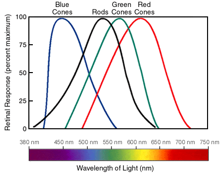
The fact that we have three types of cones to detect an infinite number of colors means that there are only three degrees of freedom to our color perception, so any color or mixture of colors which excites our cones in the same pattern will look the same to us! Because our brain processes individual colors and mixtures of colors the same way, we can mix colors to create color sensations which do not correspond to frequencies of light. Magenta is a mixture of red and blue light, so it excites the red and blue cones in our eyes without exciting the green cones. Since green is between red and blue on the color spectrum, there is no single light frequency which will excite our red and blue cones without exciting our green cones as well, so we see a color that isn’t in the rainbow!
Color Psychology and Pointillism
It turns out there’s more to color psychology than meets the eye (pun absolutely intended). I’m going to touch on a bit of it here.
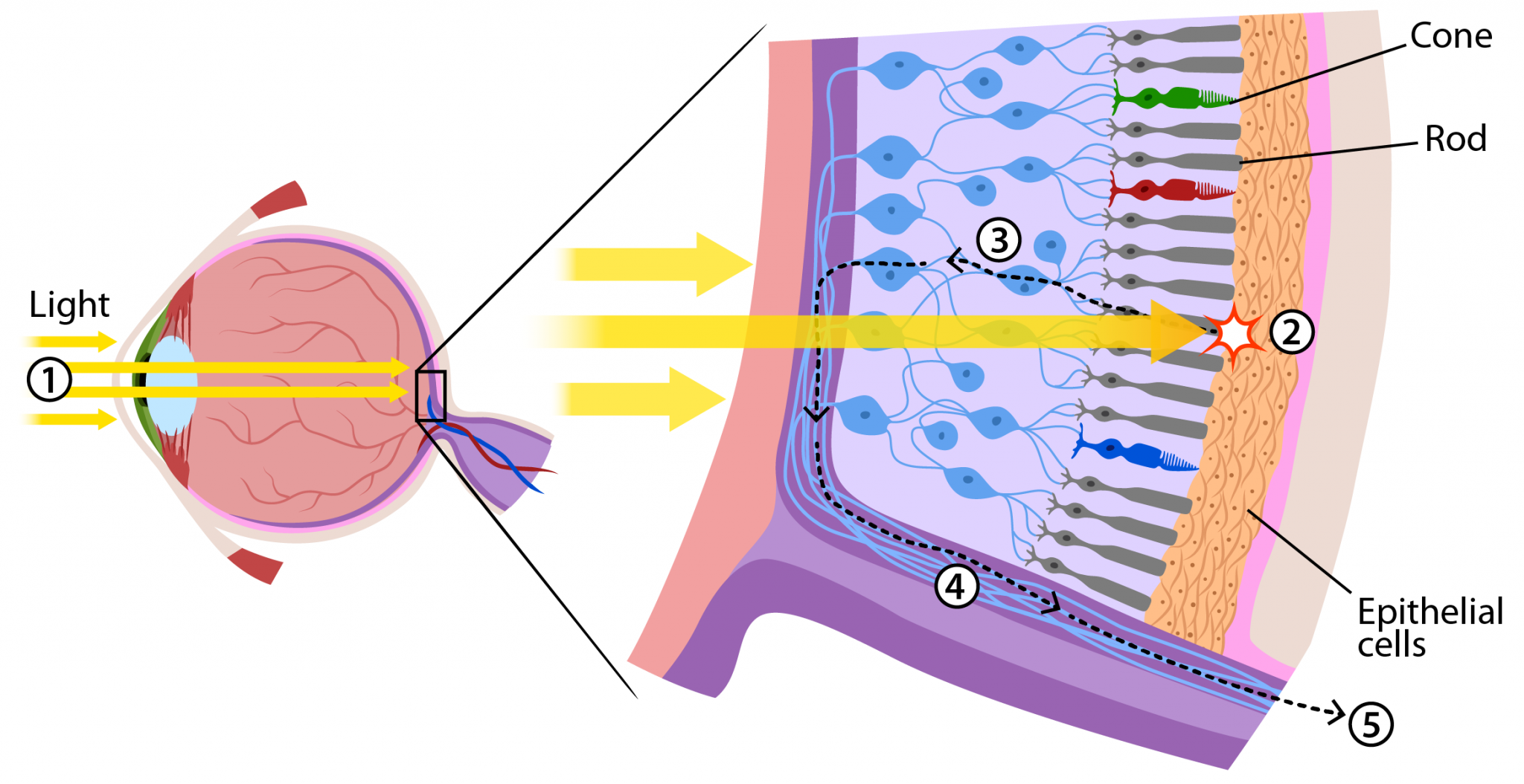
Our eyes have far more rods than cones, so we recieve sensory information about relative lightness (which shows us shapes and edges) at a much higher resolution than information about color. However, we don’t see colors blurred across lines. This is one indicator that our brains are doing some “preprocessing” of our vision to integrate the information coming from the photoreceptor cells in our eyes. There are plenty of optical illusions which exploit this preprocessing in our color vision system to fool us into seeing things which aren’t there or seeing static patterns change color just because our brain is trying to construct a coherent image.
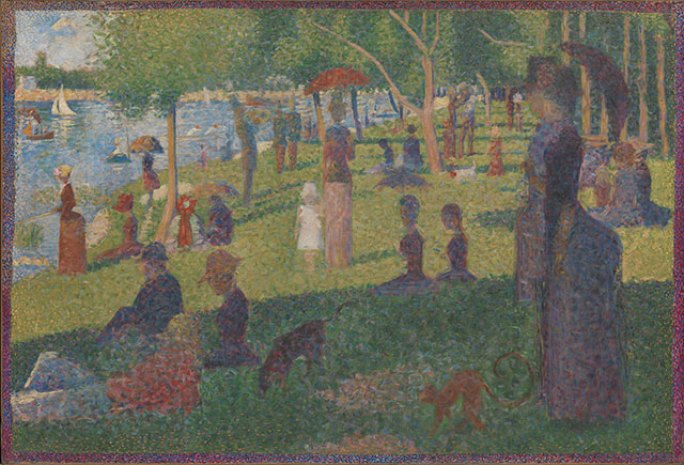
One particular way that our low resolution color vision can be exploited is using an art style called pointillism. In pointillist paintings, each dot is a pure, unmixed color, but from a distance, the colors combine into a variety of hues and shades.
This principle is also the basis for computer monitors, color TVs and color printers: a color pixel (a single dot on the screen) actually contains three subpixels which are red, green and blue, respectively. By varying the brightness of each of those subpixels, a monitor can trick our eyes into seeing a wide variety of colors. Similarly, a printer can overlay pigments of three different colors in different proportions onto a single page to trick us into seeing those same colors. Interestingly, not all monitors can show every possible color, the range of colors they can display is called the monitor’s gamut and it’s determined by technical or design limitations.
![]()
The Bauhaus Theorists
There are two artists whose thoughts on color are important to discuss, Johannes Itten and his student, Josef Albers. Itten and Albers were both faculty at the Bauhaus, an art school in Germany between the World Wars which is considered to be the birthplace of design. The Bauhaus was home to several artists (beyond Itten and Albers) who used color in new ways, including Wassily Kandinsky and Paul Klee.
Itten’s book The Art of Color discusses color schemes, and how artists should choose them. He claims that all effective color schemes exhibit one or more of seven types of contrast, some of which are based on objective factors like hue or lightness and others which are more subjective, like contrast between warm and cool and contrast of extension, which has to do with color “weight.”
Albers’ book Interactions of Color approaches color perception through a series of studies using colored paper. He demonstrates that our perception of color is actually quite relative, we cannot really remember colors and different contexts and lighting conditions can make the same color look different or make different colors look the same. For example, in the image below, the two small squares are the exact same color, but look different based on their contexts.
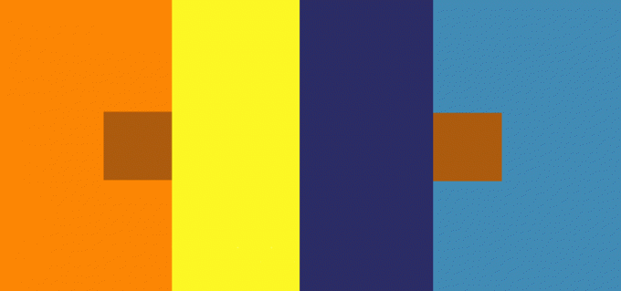
Albers’ observations make reasoning quantitatively about color in the real world very difficult. Cameras measure the color of light entering their apertures, not the material color properties of real objects, and two colors which are physically the same will not necessarily look the same under different lighting conditions.
The limitations of cameras mean that color causes a lot of problems for computer vision researchers. If the same object can have different colors in different lighting, it is difficult to reason about objects in images based on their color. When working with the color schemes of websites, though, we do know that (within the error of different monitors) the color encoded on the site is the color that the designer intended, so at least some of these sensor problems with color do not apply.
Color and Culture
Unfortunately, having digital colors doesn’t solve our problems, color perception turns out to be highly culturally relative. People from different cultures perceive different color categories, and some people can even distinguish between colors that people from other cultures see as identical. I’m not going to go into the details here, but this article discusses these issues at length. Further, different people within the same culture can have a variety of forms of colorblindness and color sensitivity which make them see colors differently. Many undergraduates in an introductory philosophy class may ask “what if the colors that you see are different from the colors that I see?” as a joke. In color science, though, that is a real technical challenge to be overcome.
As you can see, color theory is an incredibly deep topic with a long, complex, multidisciplinary literature studying it. I’ve only scratched the surface here, but now that we’ve introduced a few ideas about how color works, let’s talk about digital images. Remember, our goal is to eventually be able to measure the difference between two color schemes.
Color Images
Mathematically, we can talk about images as two dimensional signals, with intensity values that vary with X and Y position. Since computers cannot represent continuous values, we sample the signal, taking its value at regular intervals. These samples are called pixels and the number of samples in each direction is called the resolution of the image. The intensity value can either be a scalar (a single number, intensity) for grayscale images, or a vector (with multiple values, commonly red, green and blue) for color images. If the intensity is a vector, each pixel will have three or more numbers associated with it to encode the color of that pixel. Digital cameras have a series of sensors which detect the frequencies of light entering the camera at each X-Y position. Computers can replicate these colors of light by mixing red, green and blue light at each point on the monitor, or by mixing cyan, yellow and magenta ink in a printer.
Standard Observer-based Color Encodings
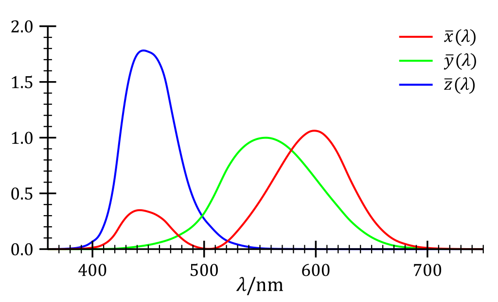
In order to get past the inherent subjectivity of color perception, the CIE (International Commission on Illumination) uses a “Standard Observer” color mapping function, developed in 1931, to map between frequencies of light and color encodings which capture some elements of color perception. The Standard Observer color encoding is usually represented with three numbers labeled XYZ. While the standard observer is based on human subjects research, it’s inevitably a construct which doesn’t necessarily represent everyone’s color vision.
There are other color encoding systems, though. The RGB system which is in wide use today is the XYZ space with a different set of axes. If you remember your linear algebra, we can switch where the axes are in a vector space using a change of basis, which can be computed using a linear transformation. Linear transformations can be represented by a matrix, so the conversion from XYZ color to RGB color is really just multiplying by a matrix, which is shown below. Different color encodings have different gamuts depending on their boundaries and scaling. Notably, applying linear algebra to color space teaches us that there are no true primary colors: any combination of orthogonal color vectors can serve as a basis for the color space. As a result, we can use the primary colors cyan, magenta and yellow instead of red, green and blue and describe the same colors.

Perceptually Uniform Color Encodings
Despite the fact that red, green and blue can describe all of the colors, the rate at which we perceive colors as changing varies in RGB space, so pairs of colors which are the same numerical distance apart, may not appear to be “the same amount” different. For example, on a 0-255 scale in RGB color space, red value 192 looks more similar to value 212 than value 212 looks to 232. For accurately reproducing images, this non-uniformity isn’t a problem, but for designers who want to know that two sets of colors look the same distance apart, we’d like to have a perceptually uniform color encoding system.

This observation serves as the basis of Albert Munsell’s 1943 color system. Munsell’s goal was to create an arrangement of the colors in 3D space which was perceptually uniform, meaning that every pair of two neighboring colors looked equally far apart from one another. He arranged the colors vertically from light to dark and radially from unsaturated to saturated, where the circular position of a color corresponded to the color wheel. This system, which measures color along hue (red vs. blue vs. orange), chroma (pale vs. vibrant) and value (light vs. dark) axes, is a natural way to describe color for artists and designers, who often think in terms of the color wheel.
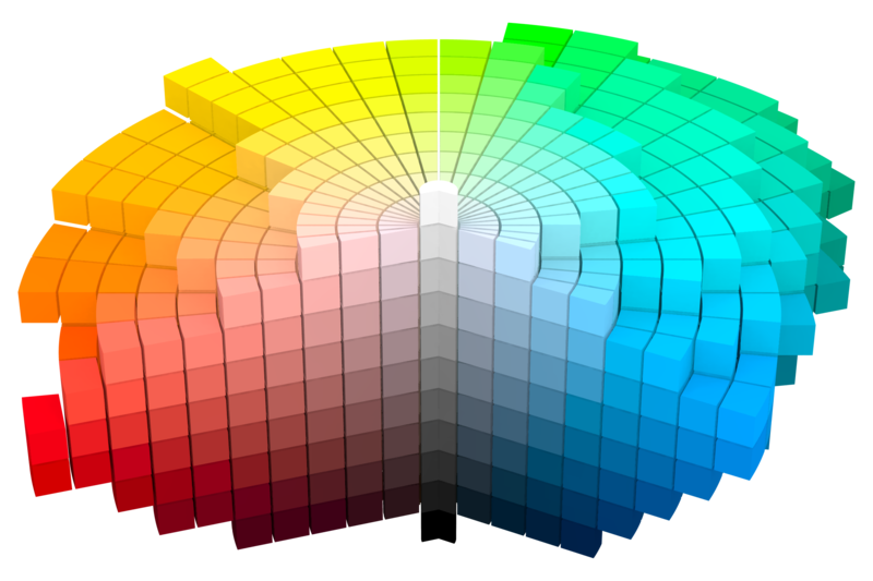
This space doesn’t form a neat shape like a sphere or cylinder because we generally don’t see as much difference between saturated and unsaturated colors when those colors are very light or very dark. This is a trend in color theory (and in science in general): good models are usually messy and neat models are usually wrong.
CIELab and CIELCh
Like Munsell, the CIE also conviened to construct a perceptually uniform color encoding system. Their goal was to design a system so that there would be a single threshold where color differences below that threshold are imperceptable and color differences above that threshold are perceptable. Their solution was the Lab color space, developed in 1976, where L represents lightness, a represents the green/red axis and b represents the blue/yellow axis. While it is defined in terms of the XYZ standard observer, the relationship between them is nonlinear (it requires more than just a matrix multiplication) and somewhat complicated, see the wikipedia page if you’re curious. Like XYZ color space, we can use linear transformations of Lab color space to create other color spaces which are more meaningful, for example, LCh color space, which uses Munsell’s concepts of lightness, chroma and hue.
As we learned from Albers, perceptions of color similarity are not consistent: colors can look more or less similar based on context. As such, claiming that a color system is perceptually uniform, even for a constructed standard observer, doesn’t really work. This dilemma is a problem for us, since we’re trying to describe color schemes. Rather than give up, however, we can still get a reasonable solution by making a simplifying assumption. In our case, we can assume that the relationships between each pair of colors is the same regardless of context. While this assumption isn’t true in general, it is only obviously wrong for specially constructed color schemes like the ones in Albers’ book, and isn’t a more extreme assumption than the standard observer assumption. Further, since the difference between two color schemes is a subjective, perceptual difference and not something precisely defined in the first place, any measurement we make will be approximate in the end.
I think that’s enough for one post! In another post, I will discuss how we can model the difference between color schemes as a distance metric on color distributions using the Earth Mover’s Distance.
You can see my next post on color scheme distances here!