Talking Mathematically About Color Schemes (Part II)
Last time, I posed the question, how do you measure the difference between two color schemes? If you’re just getting here and didn’t read my previous post on color theory, I’d recommend checking that out first! To quickly summarize, I started by discussing color, how we’ve historically understood it and how human color perception actually works. I then discussed a few color systems and defined how computers represent color.
What Was I Looking For, Again?
Before I start here, though, I realized I never really said what I meant by “measure the difference between two color schemes.” What I mean is that I want to find some math that I can use to know whether a pair of color schemes are more similar to each other than another pair of color schemes.
Generally, in information retrieval, data science, digital humanities and other related fields, we use the mathematical concept of a distance metric to discuss concepts of similarity and difference. While I’ll go into what that means in a little more detail later, the gist is that it should be a function of two arguments which returns a single positive real number. If two color schemes are very similar, this number will be small, and if they are quite different, it will be large. We can then use this metric to do things like quickly retrieve similar-color photos from a database, find clusters of similar color photos or measure the average color homogeneity of those photos.
Additionally, there are a few intuitive rules that our metric should follow: two color schemes with several colors in common (e.g. one color scheme which is blue, green and gray and another which is blue, purple and gray) should have a smaller distance than two color schemes with no colors in common (e.g. blue, green and gray vs. red, yellow and orange). Additionally, slight changes in color should matter less than large changes in color (e.g. light blue and light green should be very close to dark blue and dark green, but not as close to black and pale green).
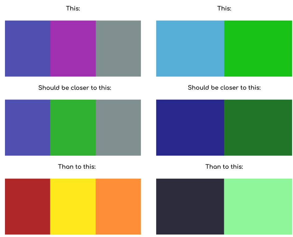
Of course, different people have different ideas of which color schemes are more similar, and some people might even disagree with these examples. It’s important to keep in mind that a metric like this is a model of human color perception, not any fundamental, scientific or objective measure. If we wanted to be more scientific, we could do a study and measure what people think, and build a model that agrees with most people’s ideas about color similarity, but we’ll never be able to make a perfect model, since people disagree. I think it is better for us to come up with something that works alright, and keep its limitations in mind. As statisticians like to say, “all models are wrong, but some are useful.”
In this post, we’re going to start by looking at how to measure the difference between two colors, then define what a color scheme is in our quantitative framework and look at ways of extending our way of measuring difference to color schemes. We’ll eventually get to the main idea of an influential paper published by Yossi Rubner, Carlo Tomasi, and Leonidas J. Guibas. These are not my ideas, and they’re not particularly new, but they’re pretty neat and not super well-known outside of the computer science and data science world.
Color Distance
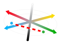
So, given two colors represented as points in Lab color space, how do we quantify the difference between them? This is a much easier question, at least mathematically, since each color is a point in a vector space. We can say that the difference between two colors is measured by the distance between their encodings. Since Lab color space is perceptually uniform (or at least reasonably uniform), shorter distances should correspond to closer colors. The simplest way to measure this distance is the Euclidean distance (the length of the line between the two points), so for vectors \(X\) and \(Y\), the Euclidean distance is defined as
\[\sqrt{\sum\limits_{d=1}^n (x_d - y_d)^2}\]Where \(n = 3\) and \(x_1\) is the \(L\) value, \(x_2\) is the \(a\) value and \(x_2\) is the \(b\) value. Visually, this looks like this:
It turns out the CIE defined this as their official color distance in 1976, but have made a few modifications to make a slightly more correct color distance measure in the years since (see here). These more precise definitions are really only meaningful in the context of industrial manufacturing, so we won’t worry about them for now. Using this distance metric, a distance of about 2.3 (in the units of Lab color space) is the threshold for a noticeable change.
One important concept here is that the Euclidean distance is a metric, which means that it is a function \(d(x,y)\) which satisfies a couple of important properties:
- \(d(x,y) \geq 0\). There are no negative distances.
- \(d(x,y) = 0\) if and only if \(x = y\). The distance can only be zero if the two objects being compared are equivalent.
- \(d(x,y) = d(y,x)\). The metric is symmetrical.
- \(d(x,z) \leq d(x,y) + d(y,z)\). This is called the triangle inequality, it means that given three points, if you draw a triangle between them, one side of the triangle can’t be longer than the sum of the other two sides. Generally, to satisfy this requirement, a metric must measure the shortest distance between two objects.
I say “objects” and not “colors” or “points” because we can define distance metrics on anything, including shapes, sets, strings of characters or other more sophisticated data structures, and then use the same algorithms to process new kinds of data. In particular, we’re going to try to quantify the difference between color schemes by defining a distance metric on color distributions.
Color Distributions
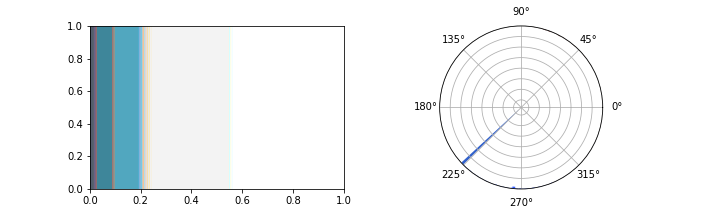
Each pixel in an image has a color. To talk about the whole image, we end up talking about a population of pixels, which have colors that are distributed across color space. We can reason about this distribution like a probability distribution (even though the actual colors of pixels in an image aren’t random), and describe it using a histogram. In photos, color histograms tend to be quite noisy, but on websites, since most pixels are drawn from a small list of colors specified by the designer, the histograms tend to be quite sparse. For example, below are two different visualizations for the color distribution for this website: the one on the left is an area plot where the size of each bar is proportional to the number of pixels of that color and the one on the right is a circular histogram, where angles are the colors of the color wheel.
And for another website:
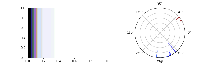
(Okay technically the circular bar graph on the right isn’t a perfect representation of the color scheme, since it is two dimensional and excludes very light and very dark colors. It’s impossible to show the full histogram directly, since color-space is three dimensional, so I take a slice from the middle and flatten it into a circle.)
Chi-Square Distance and KL-Divergence
Determining whether two datasets are drawn from the same probability distribution is a well explored problem in statistics. Most people encounter Student’s T Test at some point in their education as a way to determine whether two populations have the same mean. A little deeper in statistics, you may find a chi-square test (Pearson’s Goodness of Fit test) which actually measures the likelihood that two samples of categorical data are drawn from the same distribution. Even deeper lies the Kullback-Leibler divergence (KL divergence) which measures the relative entropy between two distributions. Are any of these measures a good basis for a distance metric on color distributions?
We can construct a distance metric out of the same math as the chi-square test. The chi-square distance is defined as
\[\sum\limits_{i=1}^n \frac{(x_i - y_i)^2}{(x_i + y_i)}\]where \(n\) is the number of histogram bins, and \(x_i\) and \(y_i\) are the \(i\)th bin of each histogram, respectively.
This distance metric is good for categorical distributions, where each histogram bin is a distinct category and can’t be compared directly, so we can apply it to our color histograms if we treat each possible color value as a category totally different from each other category. However, that ignores the important spatial information we get from using a color space! Two color schemes which were each rotated by one bin around the color wheel would look almost identical, but under this distance metric, they would be as different as possible.
With that in mind, the KL divergence starts to look like a good choice, since it can describe our distribution over 3D space. The KL divergence is defined as
\[- \int\limits_{-\infty}^{\infty} x(c) \log(\frac{x(c)}{y(c)}) dc\]where \(x(c)\) and \(y(c)\) are the probability of color \(c\) occurring in distribution \(x\) and \(y\), respectively. KL divergence is good for comparing two continuous distributions, and we can easily treat our distribution as continuous (using a Gaussian kernel estimator or some related technique). Unfortunately, it runs into problems when the probability of a color is zero in one distribution, but not another, which happens often when colors do not overlap. It also turns out that KL divergence isn’t actually a metric: it doesn’t satisfy the symmetry property, so \(D_{KL}(x,y) \not = D_{KL}(y,x)\). While we can still use it, having to determine the order between our two color schemes leads to unpleasant and counterintuitive results.
There are several other distance metrics that are commonly used for color unrelated to probability distributions, including the set difference and Hausdorff distance, but I’m not going to go into those here. These are all different models for difference which are useful in different circumstances.
It turns out there is a good distance metric we can use that comes from a very different world: the Earth Mover’s Distance (EMD), which is defined in terms of an algorithms problem called the Transportation Problem.
The Transportation Problem
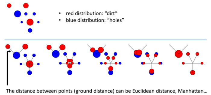
The Transportation Problem has a pretty intuitive setup. Imagine you have a construction site, with piles of dirt in several different locations, and several holes in different locations. In order to continue construction, you need to level the ground by filling the holes with dirt. Moving dirt isn’t cheap, though: you need to pay your workers a fixed cost for each kilogram of dirt you move, times the number of meters you move it. Alternatively, you can pay your dirt supplier to add or remove dirt from anywhere in the construction site for a fixed cost per kilo, but that cost is more expensive than having your workers move the dirt.
Finding the lowest cost strategy for transporting the dirt turns out to be hard, but not impossible, to solve efficiently. It is in a class of minimum-cost flow problems which can be solved using linear programming with the Network Simplex Algorithm. I’m not going to go into the details of how that works, if you’re interested, take a class on optimization problems, or just read a bunch of wikipedia pages. The point is that we have an efficient algorithm which can find the minimum cost solution.
The Earth Mover’s Distance
What does this have to do with color schemes? Well, it turns out we can use it to define a distance. A probability distribution is a lot like an arrangement of dirt: both can be described by a function over some space (either a physical space for the dirt distribution or a sample space for the probability distribution), so we can solve the transportation problem for two probability distributions. It turns out that the minimum cost transportation strategy meets all of the requirements we had for a distance metric, and we can use it in combination with the CIE’s perceptually uniform color distance. We call this distance the Earth Mover’s Distance (EMD) or the Wasserstein metric.
This metric has an intuitive interpretation: it’s the amount we need to change the color of each pixel in an image until it has the same color scheme as another image. This metric is “smart” enough to know that if one image has dark blue and dark green, while another image has light blue and light green, it’ll try to turn the dark blues into light blues, and not light greens. That means it solves the problems that we had with the chi-square distance and is actually a metric, unlike the KL divergence.
Because it’s so clever, the EMD has a ton of cool applications in data science and machine learning. When used on word embeddings, it can be used to measure semantic similarity and understand that “Obama speaks to the media in Illinois” and “The president greets the press in Chicago” have very similar meanings, despite having almost no words in common! Towards Data Science has a good explanation of this techinque. The EMD can also be used to measure the similarity of melodies or prevent mode collapse in generative adversarial networks.
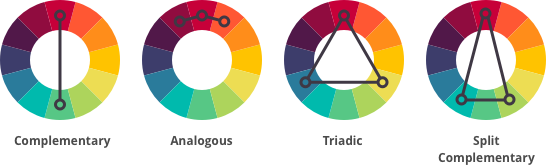
Unfortunately, treating colors as distributions ignores a lot of the color psychology mentioned in my last post. In particular, it doesn’t capture the way that colors interact. In my particular project (measuring the differences between color schemes of websites) that isn’t a huge concern, but it’s a limitation to keep in mind. This metric also doesn’t capture ideas from color harmony: families of color schemes like compementary, analogous or triadic, will look more similar than color schemes which overlap with one color but follow a different pattern.
Conclusion
I started these posts with a question: how do we measure the difference between two color schemes? To answer that question, we took a tour through color theory, figured out how to mathematically represent a color, then a color scheme and finally examined a couple candidate distance metrics before finding one with the properties we wanted. No metric is perfect, and measuring something as subjective as the difference between color schemes is impossible, but hopefully by trying to measure it anyway, we learned something about color and distance metrics.
This is a good example of how research in my field works. Trying to model and measure fundamentally subjective aesthetic qualities which are impossible to model or measure is a great way to learn more about those things (as long as you don’t take your measurements too seriously). All models are wrong, but figuring out their implications hopefully teaches you something.
As always, thanks for reading! Let me know at the address in the sidebar if you have any questions, comments or feedback.