A Short History of Web Design
Over the past two years, I’ve been studying the history of web design. I wrote an article about our work for The Conversation and wrote a post on this blog about some of that work, but I haven’t actually written about the history there yet.
The following is my 1500 word summary of the history of web design. How did we get from the first website to massive projects like Wikipedia, social media feeds and operating system emulators in the web browser? While I’m not writing a formal history with specific sources, I’m also not writing from my personal experience: I’ve done a lot of research via quantitative means and interviews I conducted with veteran web designers. Also, this is not the history of the Internet, or even of the web. I’m really interested in the external factors which have shaped the visual design of websites over its first 29 years.
The Early Web
The world wide web was proposed by Tim Berners-Lee in 1989, and launched in 1991. Over that first decade (1991-2001), the first websites were under a lot of technical restrictions which shaped their designs:
- Bandwidth added a real cost to pages in load times, so steps had to be taken to minimize page size, mostly by avoiding images and other non-textual content.
- Monitors offered a small amount of display space, both in terms of physical space and resolution. During this period, monitors had color options which were more limited than those of later monitors, either because of a small number of colors (16 color palettes and 8-bit color were still common), or a restricted gamut. Since many new computer users might not be comfortable with scrolling, best practices recommended that sites keep as much information “above the fold” or visible without having to scroll.
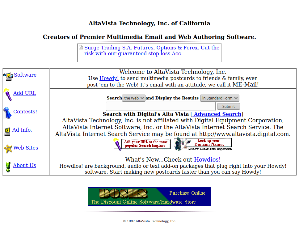
- While HTML had some support for visual customization, the original concept of hypertext prioritized linear, text-based content that did not allow much visual control. Since HTML did not bundle fonts, only a small selection of “web-safe” fonts were available. Designers turned to tables and images to gain precise control over how their content was arranged on the screen, but adding too many images came at the cost of load time.
- Sites had to be limited in size, as websites had to be updated by manually editing the HTML for each page, or in the late 90’s, using Macromedia Dreamweaver.
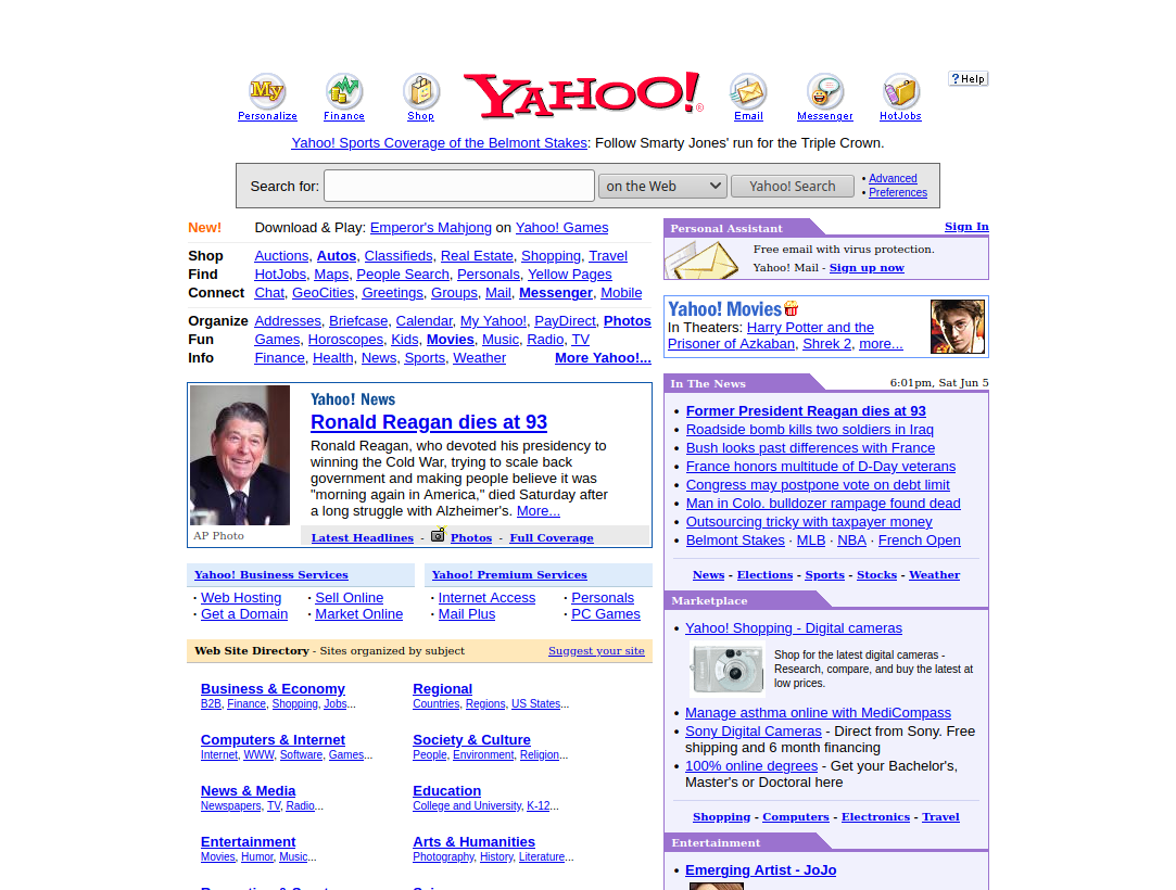
During this period, there was a major diversification in the purposes of websites. In the early 90’s, websites were usually either a novelty or a tool to communicate information. However, in the late 90’s, the web had developed into a commercial platform in its own right: the dot com boom saw a huge amount of investment in nacent internet companies, which led to a lot of commercial websites. As virtual forums and blogs became common, the web also became a platform for more personal communication and online language and culture. Despite new uses for websites, web design was still mostly informed by graphic design and prioritized text and image content in a static document-like format.
Functional differences between web browsers posed a challenge to designers. The two leading browsers, Netscape Navigator (NN) and Internet Explorer (IE), adhered to different technical specifications for emerging concepts of style sheets and browser-based scripting. Many sites would either pick a browser to support, or build two versions, one for each browser. In the early 2000’s, IE and NN were pressured into adopting the World Wide Web Consortium (W3C) recommendations by activists with the Web Standards Project. As the 2000s continued, NN fell out of use and new competitors to IE including Mozilla Firefox (a direct descendant of NN), Opera and Google Chrome emerged. While browser compatability continued to remain an issue, the W3C recommendations became the standard specification for web technologies from this point forward.
The New Millenium
In the second decade (2001-2011), many of these restrictions were lessened as technologies developed.
- Broadband Internet became more common, giving designers access to more images at higher resolution, in addition to multimedia content through Adobe Flash.
- As LCD monitors became widely available, a wider variety of resolutions became more common, and web designers could no longer make strong assumptions about their users’ displays (footnote: the history of how monitors and screen technologies have shaped design would be a great research topic).
- Through this decade, CSS was progressively adopted by the major web browsers, which allowed layout, typography and graphical elements of webpages to exist in a natural, textual way without relying on images and tables, and allowed multiple pages to depend on the same style code.
- A distinction between the client-side and server-side code of a website, now labeled “frontend” and “backend” enabled technological development. Improvements in “backend” tools like PHP and ASP allowed pages to be dynamically generated from a database, rather than hand-coded, which dramatically reduced the cost of redesigning pages. Powered by these technologies, content management systems like Sitecore (founded in 2000) and Wordpress (founded in 2003) began to emerge allowing text content to be maintained by people without training in HTML. Since they deeply separated form from content and were built to work for lots of different kinds of websites with limited customization, early CMSs tended to lead to “clunky” designs which were not well-regarded.
As websites became both more economically important and more complex, their development became more specialized. While in the 90’s, all of the development and maintenance of a website may have been carried out by a single “webmaster,” that profession started to splinter: pages were now built by web designers and systems engineers and maintained by digital editors, systems and database administrators.
With the launch of Facebook in 2004 and Twitter in 2006, followed by the release of the iPhone in 2007, the fundamental interaction patterns between people and the web started to change. At the start of this period, Americans usually accessed the Internet in their home or workplace, primarily through a search engine homepage. At the end of this period, they increasingly accessed the Internet in other places, via mobile devices and through a social media feed. These changes meant that websites had to be designed under different assumptions. Since touch screens afford scrolling better than computer mice and social media sites embrased infinite scrolling pages, the older “above the fold” mentality faded. Mobile devices also presented a challenge for sites designed to be viewed on desktop because of screen size: zooming in and scrolling to read each line of a paragraph is more difficult than scrolling down a page and touch screens encourage larger buttons that could be easily tapped rather than hyperlinks. At first, web designers responded to this problem by creating separate mobile and desktop versions of websites, but much like having multiple versions for different web browsers earlier on, this design choice was difficult to maintain and proved frustrating for users.
This period also saw an influx of ideas from Human Computer Interaction (HCI) research into web design. Ushered in by a generation of authors and consultants, ideas like usability, accessibility and user experience, which had been developed in the 70’s-90’s to support the design of interfaces more generally started to find a home in web design, alongside existing graphic design principles. This influx of ideas from HCI gave web design its own identity, distinct from graphic design.
The Javascript Revolution

After 2011, years worth of development in frontend infrastructure started to shift web designers’ understanding of the webpage from a static document to a platform for dynamic software applications. Two frontend technologies were key in this transformation:
- The document object model (DOM) interface, which allowed Javascript code to modify the content of a webpage.
- The XMLHttpRequest object, which allowed Javascript to make HTTP requests and load new content from the server without refreshing the page.
These technologies enabled the Asynchronous Javascript and XML (AJAX) model for web applications, where interaction and content are handled in the web browser, but heavy computation and database operations are outsourced to the server, which allowed resource-intensive applications to “run” on any device, with some latency, in the browser. JQuery, a Javascript library which provides a simple interface for the AJAX model, was pivotal in the adoption of these technologies. This new mode of frontend development enabled the “cloud computing” and “big data” booms of 2008-2012, which encouraged small web companies that wanted to make heavy use of server-side data and computation to outsource their server-side infrastructure to tech giants like Amazon, Microsoft and Google instead of using a CMS like Wordpress or a simple hosting service like GoDaddy.
Also around this time, a new paradigm called “responsive design” emerged as a better solution to the screen size problem. Responsive websites use CSS to adapt the size and arrangement of page elements to different screen sizes. While AJAX and responsivity can be hand-coded in JS or CSS, respectively, and had existed for several years, in 2010-2011, Javascript and CSS frameworks started to emerge to streamline the process. Javascript frameworks like Angular, React and Vue abstracted DOM manipulation and asynchronous requests to streamline application development while CSS frameworks abstracted the process of resizing and rearranging elements for new screen sizes through the use of grid systems and content hierarchies. Sites have adopted responsive design quickly, since Google’s 2015 decision to punish non-responsive sites in their search results.
The explosion in complexity had a number of effects on design.
- The profession of web designer, which was already a specialization of webmaster, began to specialize into design, UX, information architecture and frontend development roles, accompanied by similarly increased specialization on the backend.
- As more people were required to build a website, the costs associated with web design increased: high quality websites could no longer be built by a freelancer in a month, they needed teams of full time developers to maintain, which in turn incentivized large companies to make more conservative designs to minimize risk.
- Increasing technical requirements and salary led to more software engineers and computer science graduates entering the web design space, who often did not have graphic design backgrounds.
- The maturation of Javascript and introduction of the HTML5 standard ultimately led to the demise of Flash, which suffered from numerous security problems and a lack of mobile support.
Conclusion
That mostly brings us to the present. There are several developments underway, like no-code tools and web assembly (wasm), which may have an impact on web design, but it seems premature to situate them within this history before we have more perspective on what role they may play in the next decades of the web.
This is obviously leaving a lot of historically important details out: there’s a lot of rich history in the origins of the Internet, the history of web standards, the development of e-commerce, Internet piracy, streaming and its effect on music, film and TV, and smartphones and the rise of social media. If you’re interested in seeing me write about any or all of those topics, let me know!