Visualizing the Contour of an Artist’s Career With Dynamic Programming
tl;dr I made some visualizations of art images over time using an interesting algorithm! I think they have some provocative qualities which are worth discussing. My code is on Github so you can make plots like these too if you want.
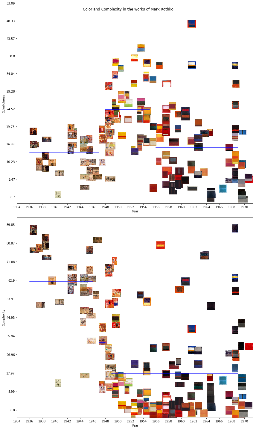
These two plots show the career of the American painter Mark Rothko. Rothko is a fascinating artist to study, the style of his paintings changed drastically several times in his life. His early works varied from impressionistic representations of urban scenes to more abstract, surreal paintings. Here are two examples:
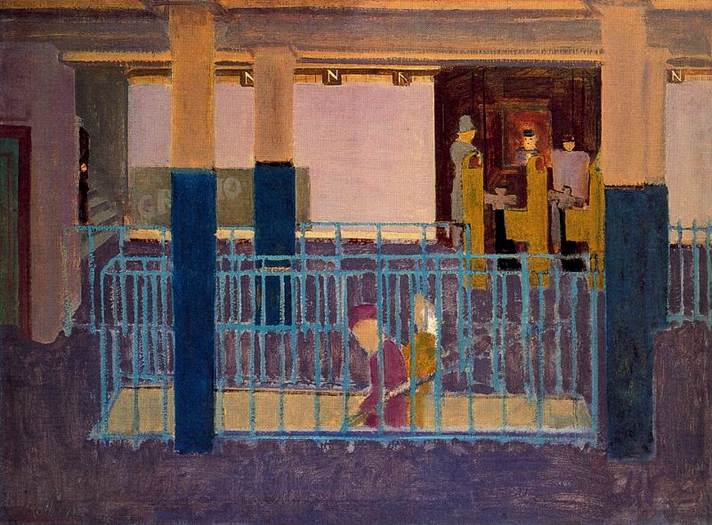
Mark Rothko, Entrance to Subway, 1938 (Image from WikiArt)
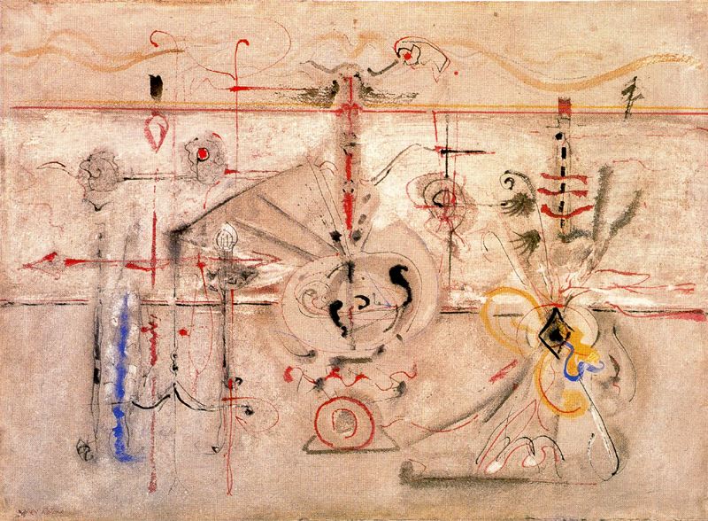
Mark Rothko, Archaic Idol, 1945 (Image from WikiArt)
In the late 1940’s Rothko’s work shifted into painting rectangular fields of color. While he primarily used bright colors, his choices shifted towards darker shades as his mental health worsened over the following decades, leading up to his suicide in 1970.
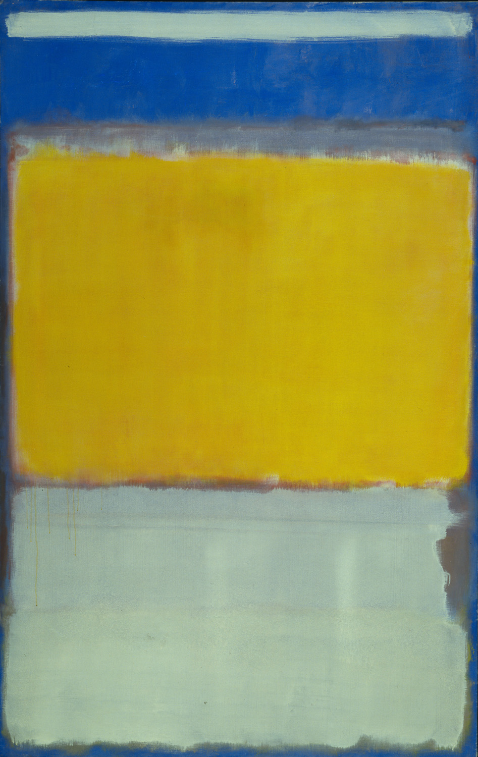
Mark Rothko, No. 10 (1950) (Image from WikiArt)
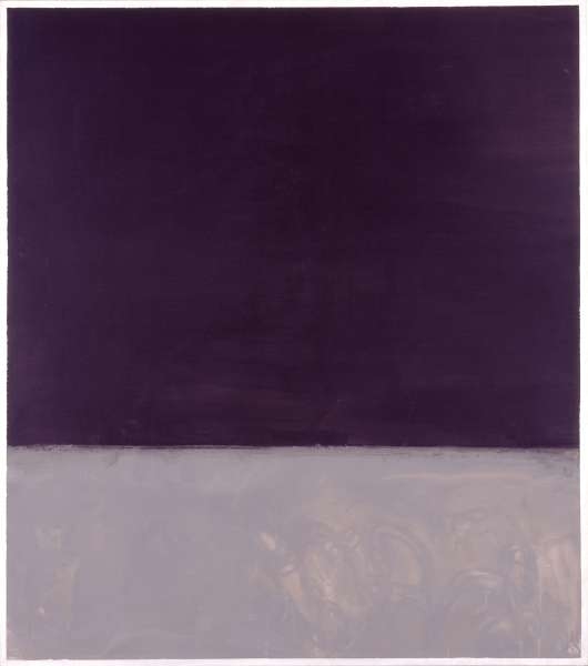
Mark Rothko, Untitled (Black on Gray), (1970) (Image from WikiArt)
With that history in mind, look again at this visualization:
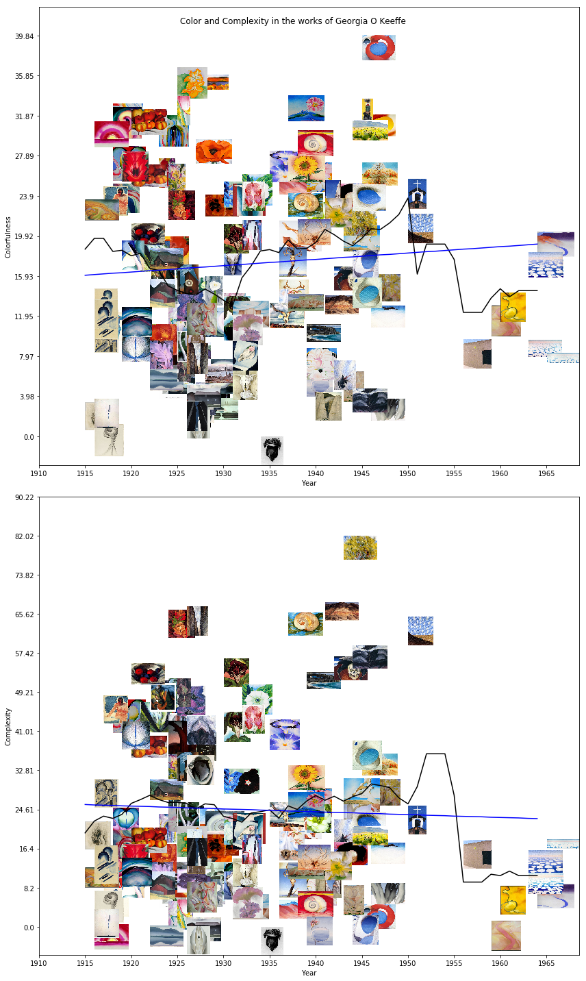
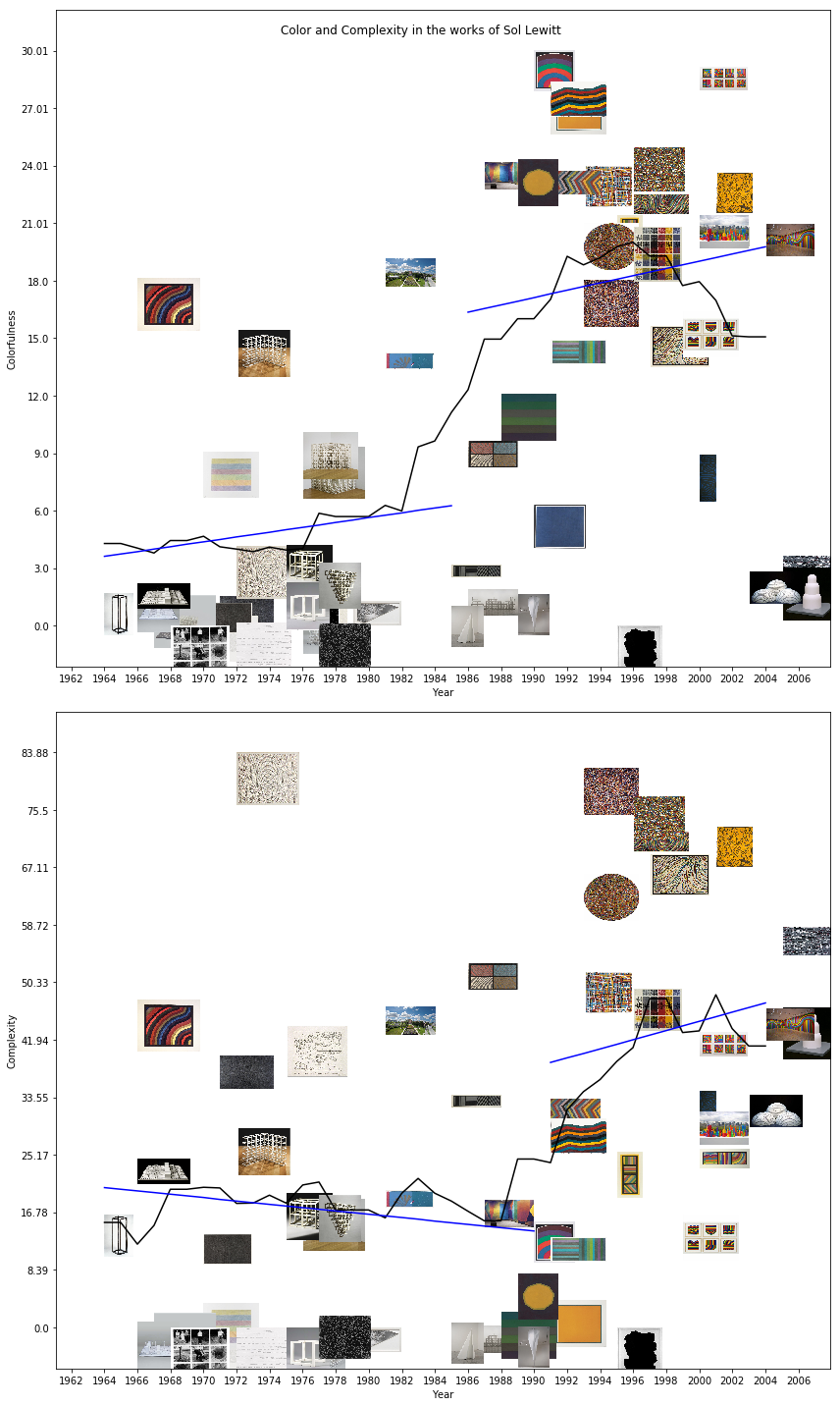
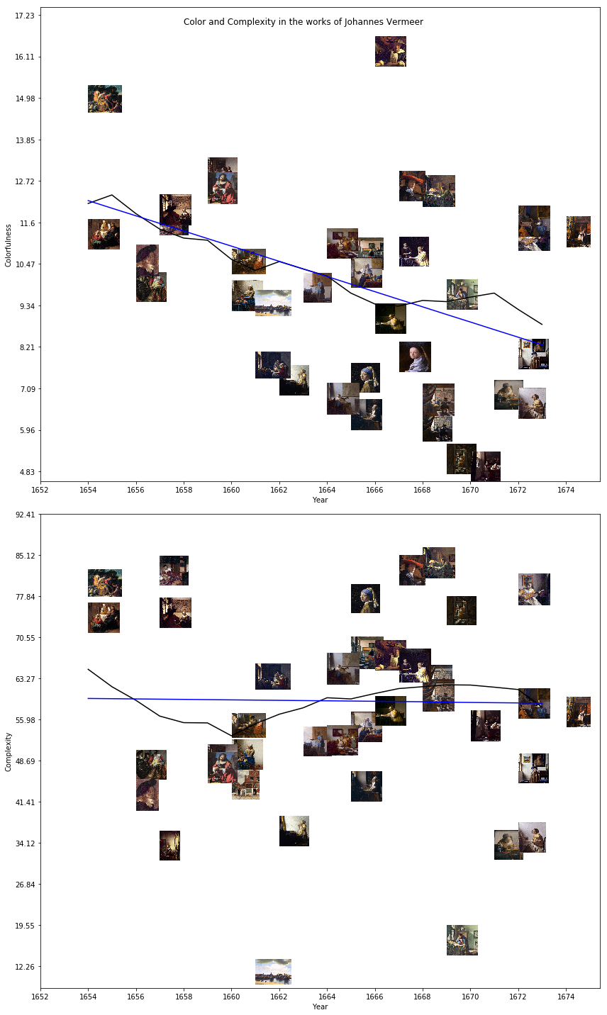
These are scatter plots. The X axis has the years of the paintings, while the Y axis has a visual statistic: in the top plot, it is a measure of colorfulness while in the bottom, a measure of visual complexity. Rather than use little dots for the data points, however, I use the images of the paintings they represent. The blue lines track the average value of the visual statistic across Rothko’s career, split automatically into periods.
The particular measure of colorfulness is the average distance in the a-b plane of Lab color space from each pixel’s color value to the average, inspired by a paper by Hasler and Süsstrunk. The measure of complexity is the average value of the edgemap found using a Canny edge detector on the image, taken directly from a paper by Machado et al..
These plots tell almost exactly the same story as my two paragraph summary of Rothko’s career. We can see the break between his initial impressionist and surrealist pieces, how the complexity plummets and colorfulness rises in 1948 when Rothko embraces color fields, and we can see how the colorfulness declines in the late 1950’s and 60’s as Rothko switches to a darker palette.
Still, the visualization captures several nuances which my summary left out. His shifts in the 40’s were not actually so sudden: the paintings steadily grow more colorful and less complex from 1946-1948. The shift towards darker colors is also not total since some of Rothko’s most colorful works were painted in 1968. Lastly, while the overall complexity drops dramatically, several of these color field paintings are labeled as much more complex than they would seem; a great deal of that complexity is present in the brushstrokes, which are more visible in some works than others.
In the digital humanities, we are interested in using technology to find new ways of looking at old topics, especially ways of making the subtle parts of humanistic inquiry, which are usually only available to experts, visible to everyone. A major theme in DH work is “distant reading” (or “distant viewing” in the case of art). An alternative to close reading, distant reading uses data analysis techniques to look at texts from a birds-eye view and make arguments about broad trends in the arts and literature. These plots are a great example of the value of distant viewing. They’re totally automated: I arrange images, select change points in the horizontal lines and scale everything algorithmically, but there is a surprising amount of analytic depth which is made visible. Lev Manovich’s recent book on Cultural Analytics is great if you want to dig deeper into this topic.
Here are some more.
Georgia O’Keeffe:
Sol LeWitt:
Johannes Vermeer:
If you’re interested, you can check out my code on github and create plots for other artists too.
These three examples are slightly different. They have a black line, corresponding to the 5-year rolling average of the statistic, and use a linear model, rather than an average, for each period. But they still tell us a surprising amount about the contour of each artist’s career, given that they are simple scatterplots.
I like these visualizations for another reason as well: they’re an interesting ground for debate about the relationship between analytics and the humanities. Are simple visual statistics a helpful way to analyze paintings? How deeply can we understand a work of art without historical context? Does computational analysis give us access to an objective art history? Are we automating away the work of art historians? I’d like to discuss the technical side of the periodization algorithm, then briefly address these questions.
Periodization
The interesting part of this visualization, at least from the computer science perspective, is the way that I segment out the life of the artist into periods. The problem is: given a dataset \((x,y)\), find the piecewise linear regression model \(\hat y = x^Tw + b\) where vector \(w\) and scalar \(b\) are chosen, along with the segmentation, to minimize the sum of squared errors \(\sum\limits_i (y_i - \hat y_i)^2\).
But simply minimizing the error runs into a problem: the optimal solution will use as many lines as there are \(x\) values, and that’s not an interesting solution, so we need to place a cost on switching from one line to another. The particular approach I use relies on the Bayesian Information Criterion, which gives a statistically-informed tradeoff between minimizing model complexity and maximizing the likelihood of the data:
\[BIC = k \ln(n) - 2 \ln(\hat L)\]Where \(k\) is the number of parameters, \(n\) the number of data points and \(\hat L\) the maximized likelihood.
So how do we find the optimal segmentation? Dynamic programming! If you aren’t familiar, dynamic programming is a classic computer science technique for solving optimization problems which can be factorized into a recurrence relation. In this case, we can define a recurrence relation in the error of the optimal solution from \(x_1\) to \(x_2\) with \(k\) change points.
\[OPT(x_1, x_2, k) = OPT(x_1, x_j, k-1) + SSE(x_j, x_2)\]Here \(SSE(x_j, x_2)\) is the sum of squared error for the linear model fit to the data in the interval \((x_j, x_2)\).
The algorithm to solve this problem starts by computing every value of \(SSE\) for valid start and end points and stores them in a table, then iteratively finds the best solution with \(k=1\) changepoint, then \(k=2\) changepoints (which relies on the solution for \(k=1\)), and so on.
This isn’t my idea, it’s a common practice in computer science. The oldest reference to the technique that I could find is actually a one-page paper from 1961 by Richard Bellman (of Bellman-Ford algorithm fame). It’s also highly related to the math behind Hidden Markov Models.
The dynamic programming approach is surprisingly good for segmenting the careers of artists, especially when combined with the Bayesian information criterion. It can be generalized for any model of any feature, not just lines fit to a single characteristic like colorfulness. For example, we could project our paintings into some unsupervised deep representation and segment the works based on those features. But that doesn’t really lend itself as well to visualization.
Automatic is not Objective
Some people might see these visuals and say “oh wow you’ve solved objective art history! You can organize the visual culture of the past based on purely objective criteria!”
Even though the approach I’m using here is automated, it’s not as objective as it seems. The measures of colorfulness and complexity that I’m using, even though they’re based on papers which did psychological studies of human perception, were selected based on my intuition about what makes a painting colorful or complex. They don’t work well across the entirety of art history: I selected and tuned them to produce good results on a dataset of American expressionist painters. The artists that I’ve selected to show here are also my favorites, selected after looking at hundreds of similar plots. The paintings included are an artifact of which works have been digitized by countless curators and uploaded to WikiArt, and encode assumptions about which artists and works are significant enough to be part of the Western canon. These visualizations are creative works in their own right, and my choice of algorithm, measure, model selection criterion and example data are all creative, artistic, analytic decisions which have shaped the end result.
In fact, viewing “colorfulness” as a property of a painting depends on ideas about color which were not developed until the late 19th century (see my previous post about color theory for more on that), and the idea of measuring art out of context is deeply modern and formalist, and isn’t a good lens for pre-modern art. My example with Vermeer above is already pushing this boundary and isn’t really a good example of responsible art history. A historically grounded analysis of older works would have to use different, probably less quantitative measures.
However, there is art historical precedent for this sort of analysis on older paintings. The early 20th century art historian Heinrich Wölfflin described shifts in the art of the 16th and 17th centuries in terms of five axes:
- Linear to painterly
- Plane to recession
- Closed form to open form
- Multiplicity to unity
- Absolute clarity to relative clarity
A computer vision algorithm could certainly be built to measure those characteristics and separate out work into periods based on them. But such an approach would still be informed both by the programmer’s eye and Wölfflin’s, and wouldn’t be a truly objective measure since there is no one objectively correct, mathematical definition of “absolute clarity” or “painterly.”
No, I’m not automating the work of Art Historians
The last big question I think this project brings up is related to the automation and commodification of art history. Some people might say “If we have automatic algorithms to perform analysis and can measure their optimality, why bother writing papers about art history?”
For whatever reason, I get questions like this one a lot whenever I talk about AI in the arts & humanities. I hate this perspective. I think it misunderstands the point of humanistic inquiry.
There is no “correct” or “optimal” way to think about the past, and the struggle to make sense of the complex and contradictory information we have is valuable in itself. Computers can’t think contextually or make arguments (well, at least not any time soon), and they are limited to the relatively shallow insights which come from visual statistics.
Instead, I think, in addition to communicating concepts visually, “distant viewing” technology is valuable because it gives us perspective. When an expert looks at a painting, it is difficult for them to separate their interpretation from all their prior knowledge and training. They immediately recognize symbols and stylistic traits and start thinking about questions of meaning and interpretation. When we see that a computer vision algorithm only picked up on the fact that a given painting has a lot of red in it, that naivete is staggering, and kind of funny. It can help us to get out of the details and take a shallow, less thoughtful perspective over a wide range of works. While that’s no substitute for the actual, precise, contextualized work of art historians, I think it’s worth thinking about as well.
Conclusion
Thank you for reading! Check out my code on Github if you’re interested in more of the details. I’m also not an art historian, so if anything I’ve said here is incorrect, I’m receptive to corrections. Also, let me know if you have any questions or comments, or if you’d like me to make one of these plots for your favorite artist!