Why Does AI Art Look Like That?
By “that” I mean images like these: from Midjourney (left) and StableDiffusion (right).
In this post, I’d like to answer two questions:
- What, exactly, do AI generated images look like?
- Do they have to look like that, or is it a creative choice someone has made?
I’m going to try to answer those questions as objectively as possible, without getting into all of the charged issues surrounding AI art. For transparency, I am not a fan of AI art, especially the way that large image datasets violate the rights of artists. But these generators are reshaping our visual culture, and many people hold misconceptions around how they work. So I think taking the time to understand these systems is worthwhile, even if you disagree with their existence.
What Do AI Generated Images Look Like?
Style
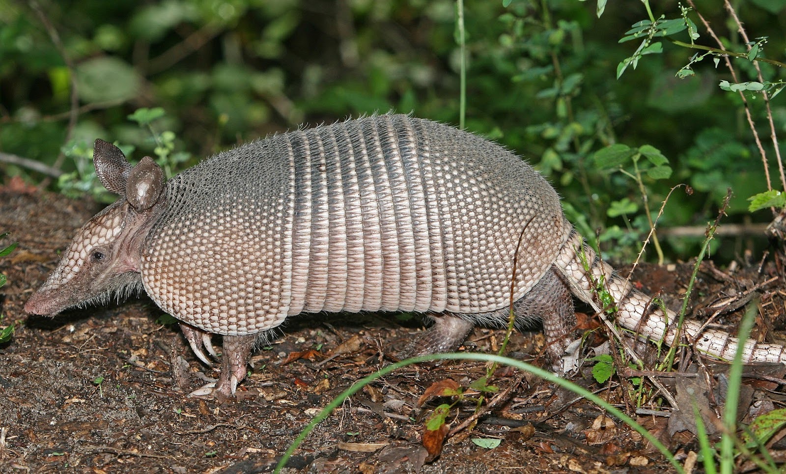
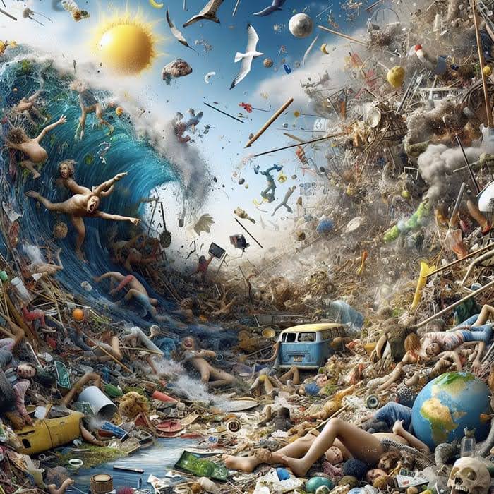
Take a close look at this image:
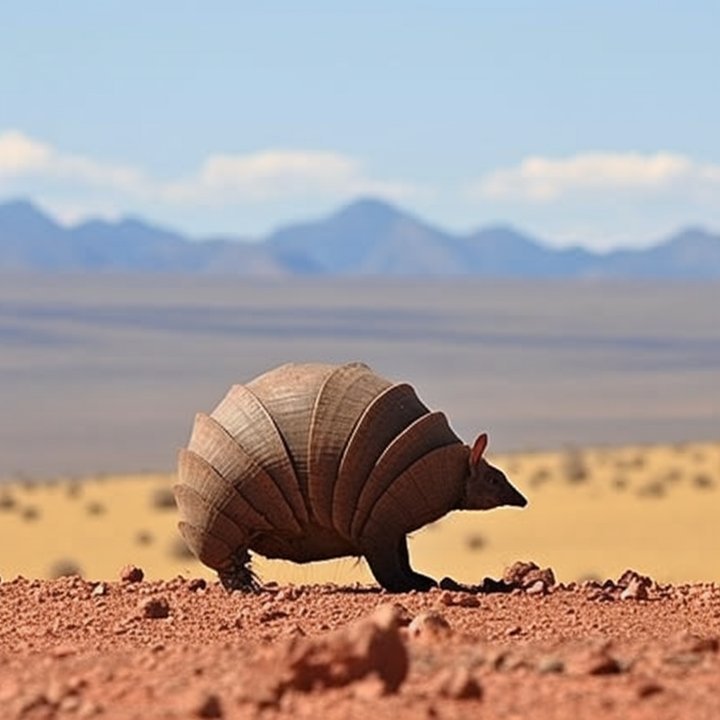
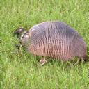
(Image from Midjourney, generated by researchers at Huawei for the GenImage dataset using the prompt “Armadillo”)
What do you see? I see:
- An armadillo-like creature, front and center, going from around a quarter of the way up the image to half way.
- Several layers of ground: one blurry in the foreground, another crisp behind it, another blurry behind it, and then a background with mountains and clouds.
- A sense of inconsistent lighting, where the background seems lit from all angles, while the creature is lit from behind and casts a shadow, giving it depth.
- The foreground-background-sky borders split the image almost perfectly into thirds, and the creature is centered horizontally, taking up the center third of the image.
- Everything is sleek and almost too perfect. Even the dirt looks clean.
- A distinctive complementary color scheme, composed entirely of muted yellows and blues.
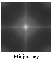
Many of these characteristics are common among images generated with Midjourney, and they are not a coincidence. They are pretty common rules of thumb given to beginning photographers who want to take better photos. They also come up in kitchy art, such as the art of Thomas Kinkaid (see this thread for a more serious analysis). In fact, we can see some of these rules of thumb by looking at the generated images in aggregate:
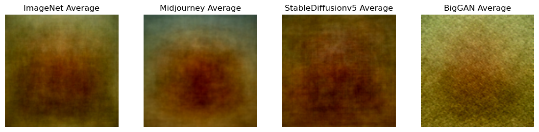
This plot shows a pixel-by-pixel average image. Each location in the image shows the average color of many photos from a dataset at that location (except with the contrast increased so they don’t all look gray). ImageNet is a dataset of real photographs collected from Google Images. Midjourney and StableDiffusion are modern AI image generators. BigGAN is an older generator, using a different technical method.
You can see the rule of thirds at play in the Midjourney average: the top third of the image around the edges is blue. This is not the case with real photographs or the less aesthetically constrained image generators. The training data (and possibly the generative process) for these models is clearly shaped by these rules.
Content
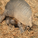
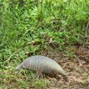
If we only pay attention to the content, we find a variety of issues. First of all the creature front-and-center looks like some kind of Star Wars creature, rather than a real Armadillo (which is much less symmetrical and has a tail).
 (Wikipedia)
The background resembles the multicolored and multileveled plateaus and mesas of the American southwest, particularly of Utah’s Grand Staircase-Escalante National Monument.
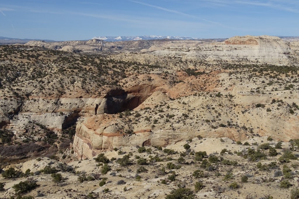
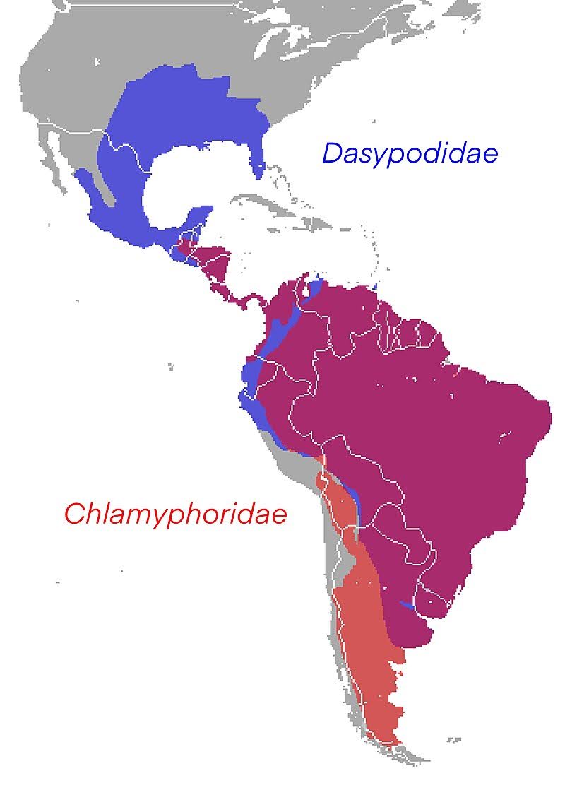
The problem is that there are no Armadillos in Utah. Their North American range is mostly in states that border the Gulf of Mexico, and they are found much more commonly throughout centeral and South America, mostly in the rainforest.
(Wikipedia)
This isn’t a huge deal. There are plenty of deserts in Northern Mexico and Texas. And most people who would look at this photo wouldn’t notice the inconsistency. But the mismatch contributes to a sense that the image is “too perfect” or “uncannily wrong.” You’ve probably seen plenty of artistic depictions of Armadillos in the desert, but not many of them in Central American jungles.
This is the kind of thing we mean when we talk about AI image generator bias. AI image generators do not generate images that resemble the world as it is, they generate images that resemble the world as we depict it. Media studies scholars call this visual culture. There is a particular grammar of subjects and depictions that the image generator model learns. This kind of bias towards American visual culture becomes more of a serious problem when we create images of human beings with specific professions (for example, AI images of doctors tend to show white men), but the issue is more pervasive than just images of people.
Depiction
AI images also have to show something. Thanks to a recent conference talk by Yifan Jiang, I now have a word for this property: AI images are depictive.
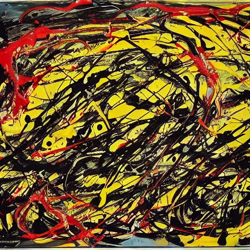
What does a non-depictive image look like? Consider this drip painting by Jackson Pollock.
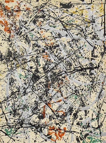
Jackson Pollock, Number 32 (1947)
At least for me, when I look at it, I imagine Pollock looming over the canvas and think about the physical process he was engaged in, and try to imagine what he was seeing and feeling. I also think about the times I’ve seen artists’ studios and looked at the floors and walls, often similarly splattered with paint. And that makes me wonder about why certain things are art and others are trash, and how intentional that boundary really is. The painting gets me to think those thoughts, but not by communicating them to me through symbols.
Today’s AI image generators based on text prompts are not capable of generating abstract representations like Pollock’s drip paintings. If you prompt them to depict a specific emotion or sense of chaos, they will depict something emotional or chaotic, instead of trying to evoke that emotion more directly. While asking for an image in Pollock’s style generates something that looks similar, the result is incoherent and does not evoke a physical process in the same way.
DALL-E 3 generated image for the prompt “a chaotic world” from this aggregator.
StableDiffusion image for the prompt “jackson pollock drip painting depicting ‘hapiness’” via openart.ai
Also, funnily enough, they cannot disambiguate homonyms, or words with two meanings. For example, if you prompt Midjourney for “crane” it will generate images with both construction cranes as well as bird cranes.

(Midjourney, generated for the GenImage dataset using the prompt “Crane”)
Do They Have to Look Like This?
No! In an ideal world, AI image generators could produce any combination of pixels. The reason we get images that look like something rather than TV static is because we have optimized the parameters within the model based on training images.
There are many ways to generate images using statistical models. Most modern image generators use a technique called “guided diffusion” which generates high quality images from prompts. This technique makes use of two models: a diffusion model and a text-image model which predicts whether a snippet of text adequately describes an image.
The fundamental idea behind diffusion models is that they are trained to take a noisy input image (in signal processing, we call the random pattern that looks like TV static “noise.” Statistically it is just like white noise in sound!) and “de-noise” it producing a sharper version of the image. The training data is created by taking real images and adding noise to them:
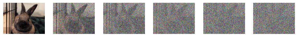
From left to right, a forward diffusion process carried out on a photo of my rabbit, Cornelius. The diffusion model learns to reconstruct each image from the image to its right.
After training, when you want to use these models to generate an image, you simply run them over and over starting with an image that is fully noise. Eventually, the generator will make sense out of the random patterns in the noise and create an image with no noise.
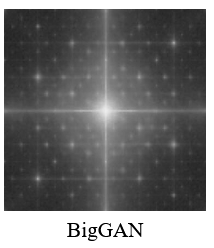
At a high level, this method explains the sleek, too-perfect look. Any small imperfections in the textures of the image are treated as noise and removed by the diffusion model. We can measure this smoothness empirically by using the average spectrogram of the images.
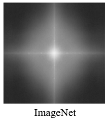
Figures from The GenImage paper.
You can interpret these plots as 2D graphs where the X and Y axes indicate horizontal and vertical frequency of a pattern, and the brightness indicates how much of that pattern is found in the image. The region near the middle contains low frequency information, like shapes, while the regions further away contain high frequency information, like texture. For more about how to interpret image Fourier transforms, I recommend this website by John Brayer.
Real images, like those in ImageNet, contain a lot of noise, and do not contain biases towards noise of specific frequencies. But the Midjourney images have very little noise, and the noise they do have is concentrated on specific spatial frequencies.
There are other generative models which don’t have this effect. For example, generative adversarial networks (GANs), which were the most common image generator from 2016-2022, generate very noisy images. However, their noise profiles are not natural, and have a distinctive ugly “funk” to them, in addition to much less logical content. For example: here are some GAN armadillos:
BigGAN armadillos, also from GenImage.
The style of these generated images is also shaped by their training data. While we don’t know a ton about the exact training data for proprietary systems like Midjourney, we know that StableDiffusion is trained on the LAION aesthetics dataset. This dataset is a subset of the LAION 5B dataset, a set of five billion text-image pairs, which selects for images of high “aesthetic” quality. That concept of aesthetic is based on user ratings: the images that are most popular are the ones that are considered aesthetic. I’ve written about the way these datasets promote a specific “#aesthetic” style of photography, rather than any true notion of the aesthetic.
(For more about LAION and LAION-aesthetic, see this wonderful data story by Christo Buschek and Jer Thorp: https://knowingmachines.org/models-all-the-way)
The biggest thing shaping the style of AI-generated images, however, is the way that we steer them. Currently, these generators are steered by text prompts. Technically, what that means is that we use a text-image model like CLIP to “guide” the diffusion process, nudging partially generated images to look more like the text prompt.
Steering the generative process using text severely limits the way that generated images can look. Only images which “look like” the text prompt are able to come out of this process. That makes it extremely difficult to specify things like style or composition, and severely limits the usefulness of image generators for serious art-making.
If I had the power to set a priority for human-AI interaction research, it would be to develop a way to describing the style and tone of images, separate from the thing depicted in the image. Currently, the only ways to do this are through references to existing artists’ styles, either by using their name in the prompt, using “style transfer” methods or referencing arcane aesthetic subcultures. Ultimately, though, there is no free lunch. Generating AI images which don’t look “like that” requires you as the artist to know what you want the image to look like and have the skill and language to express it, and requires the model to have the capacity to generate it.